
Duotones dynamiques : maîtriser le contraste des couleurs dans Photoshop
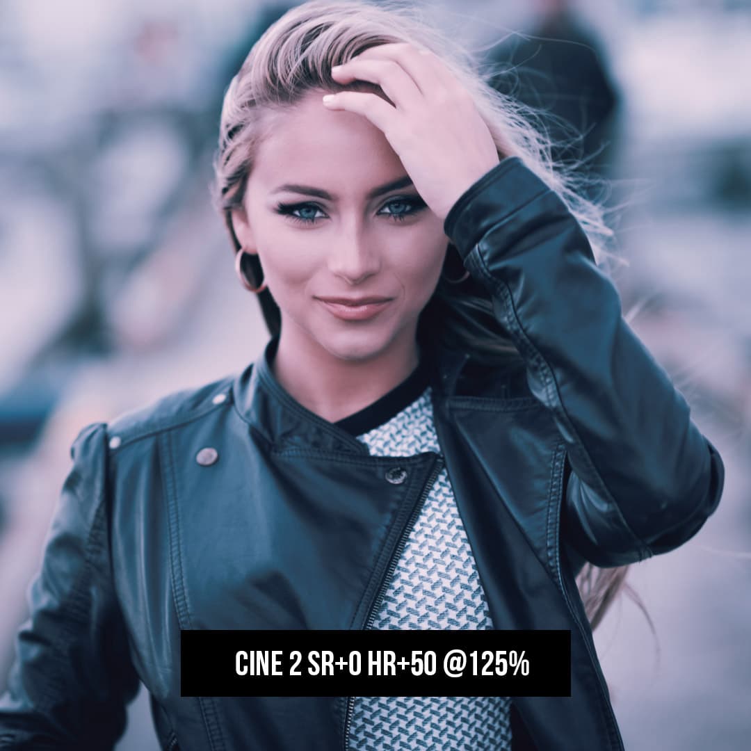
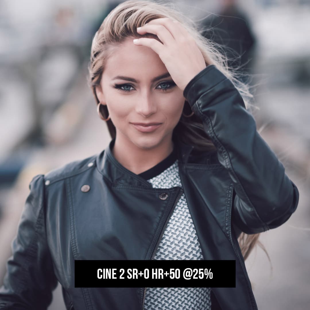
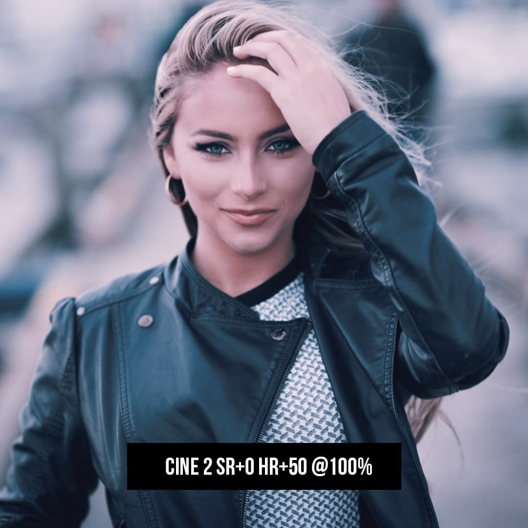
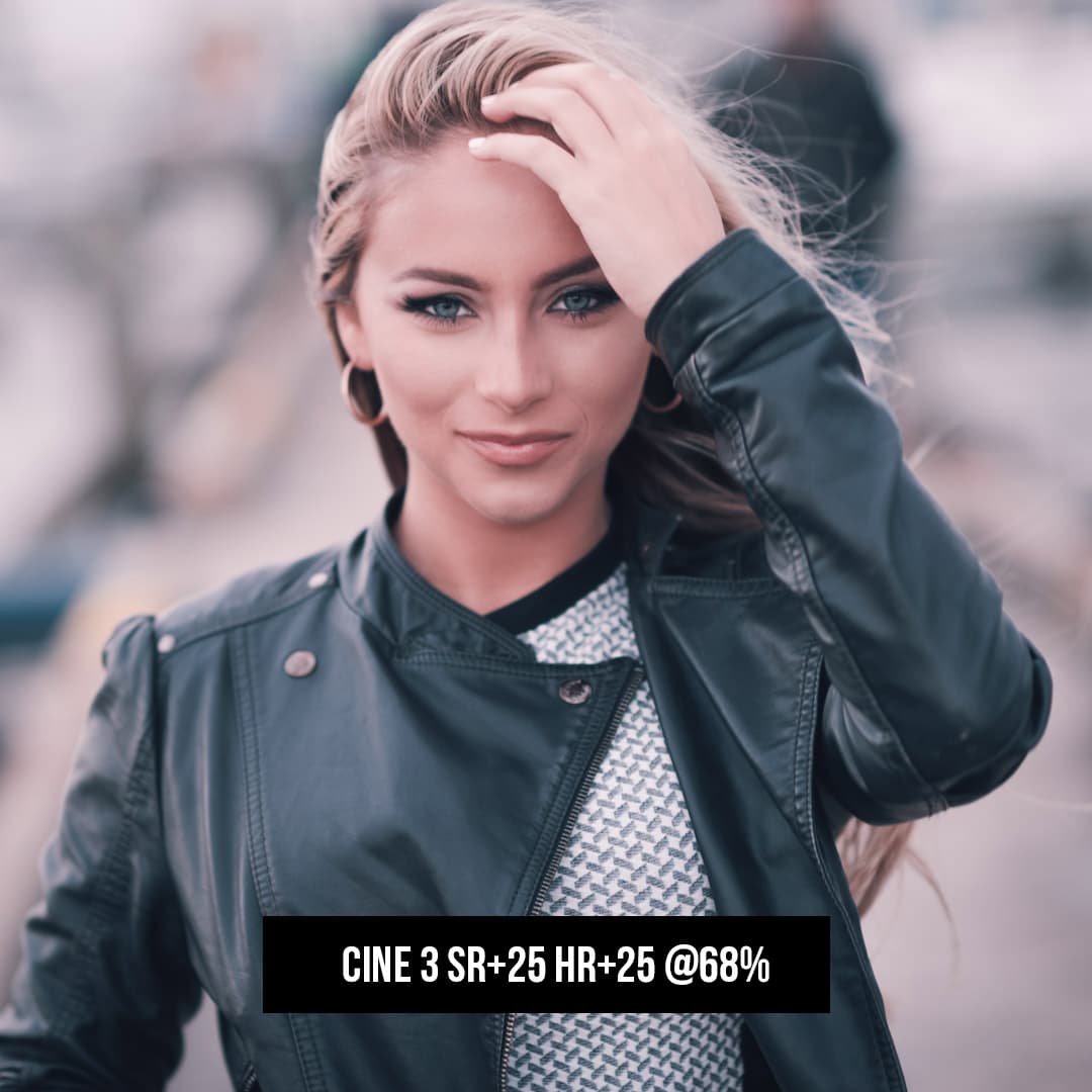
Les bichromies dynamiques sont devenues une tendance populaire, transformant des images simples en œuvres d'art saisissantes avec juste une touche de couleur. En explorant le monde des bichromies dans Adobe Photoshop, il est fascinant d'être témoin de la transformation qui peut être obtenue en appliquant cet effet. En utilisant seulement deux couleurs contrastées, une image acquiert une nouvelle dimension, renforçant souvent l'ambiance ou le thème souhaité par l'artiste. Photoshop, un puissant outil d'édition d'images, fournit une plate-forme intuitive où nous pouvons créer et expérimenter des effets de bichromie en toute transparence.
Pour comprendre le processus, il faut maîtriser l'utilisation des calques de réglage qui servent de base pour ajuster les couleurs, les tons et le contraste de nos images. Lorsque nous incorporons des bichromies dans notre travail, nous ne changeons pas seulement les teintes ; nous redéfinissons la gamme tonale et la saturation pour créer une esthétique qui se démarque. De plus, en perfectionnant l'effet bichromie, nous pouvons atteindre un niveau de sophistication dans nos images, qui peut être adapté à divers projets artistiques et commerciaux. La polyvalence des fonctionnalités de Photoshop permet de styliser nos bichromies de multiples façons, garantissant que chaque pièce est une représentation unique de notre vision créative. Lorsque nous finalisons et exportons notre travail, l'impact de ces bichromies dynamiques laisse une impression durable.
Principaux points à retenir
- Les bichromies dans Photoshop créent des effets dynamiques qui améliorent l'humeur en utilisant deux couleurs.
- Les calques de réglage sont essentiels pour personnaliser les gammes de tons et la saturation des couleurs.
- L’exportation de notre travail finalise l’aspect distinctif des images bicolores à contraste élevé.
Premiers pas avec Photoshop
https://www.youtube.com/watch?v=8uFYp0p3zfc&embed=true
Avant de nous lancer dans la création de duotones dynamiques, il est essentiel de configurer Photoshop pour améliorer notre flux de travail et comprendre les principes de base. Nous commencerons par une image en niveaux de gris , puis nous ajouterons notre choix de couleurs.
Configuration de l'espace de travail
La première étape consiste à s'assurer que notre espace de travail est adapté à la création de bichromie. Nous allons ouvrir Photoshop et personnaliser les panneaux en allant dans Fenêtre > Espace de travail . Ici, nous sélectionnons Photographie car cela nous donne un accès rapide aux calques de réglage nécessaires pour la cartographie des couleurs. Il est essentiel d'organiser nos panneaux de manière à ce que les panneaux Calques , Réglages et Nuanciers soient facilement accessibles, car ils seront fréquemment utilisés.
Comprendre les bases
Pour maîtriser les effets de bichromie, il est essentiel de bien comprendre les outils de base de Photoshop. Nous commençons par nous assurer que notre image est en mode niveaux de gris 8 bits. Pour ce faire, nous pouvons cocher le sous-menu Image > Mode . Ensuite, le calque de réglage Gradient Map devient notre meilleur allié, nous permettant de mapper un dégradé de deux couleurs sur la gamme tonale de l'image. En accédant à Calque > Nouveau calque de réglage > Gradient Map , nous pouvons expérimenter différents préréglages pour modifier l'apparence de notre image. Chaque sélection interagira de manière unique avec les valeurs de niveaux de gris, préparant le terrain pour notre bichromie.
Que ce soit pour mettre en place ou comprendre les bases de Photoshop pour notre projet, garder une approche structurée rendra notre voyage dans le monde des duotones non seulement plus efficace mais aussi plus agréable.
Les fondamentaux des bichromies
https://www.youtube.com/watch?v=9CSXeHf7SFU&embed=true
Lorsque nous parlons de bichromie, nous faisons référence à un procédé spécialisé qui améliore la gamme tonale des images monochromes. Nous utilisons cette méthode pour imprégner les images d'un thème de couleur spécifique ou pour les préparer à l'impression en deux couleurs.
Conversion en niveaux de gris
Avant d'appliquer des effets de bichromie, il est essentiel de convertir l'image en niveaux de gris . Il ne suffit pas de désaturation quelconque : il faut s'assurer que l'image est au format niveaux de gris 8 bits . La qualité de la conversion en niveaux de gris détermine la richesse et la profondeur de l'effet de bichromie final. Une image doit être convertie du mode RVB ou CMJN en niveaux de gris pour pouvoir procéder à la création d'une bichromie.
- Étape 1 : Vérifiez que le mode d’image est RVB ou CMJN.
- Étape 2 : convertissez l’image en niveaux de gris 8 bits.
Duotones et Impression
La transition de la gamme de gris à la bichromie implique l'ajout d'une seconde couleur, généralement une couleur d'accompagnement . L'ajout de couleurs telles que le cyan ou le vert peut changer radicalement la sensation émotionnelle de l'image. Les bichromies sont particulièrement avantageuses pour les travaux d'impression où une seconde couleur accentue les zones clés sans les frais d' impression CMJN .
- Considération relative à l’impression : choisissez des encres qui se complètent.
- Conseil de pro : effectuez un test sur différents papiers pour voir comment les couleurs bicolores se comportent.
En maîtrisant ces fondamentaux, nous pouvons créer efficacement des duotones évocateurs qui améliorent le récit visuel de nos images.
Travailler avec des calques de réglage
https://www.youtube.com/watch?v=3RozoxIUzhk&embed=true
Avant de nous plonger dans les détails, il est essentiel de comprendre que les calques de réglage sont des outils puissants pour l'édition non destructive dans Photoshop. Ils nous permettent d'appliquer divers ajustements à nos images sans altérer de manière permanente les données de pixels d'origine.
Création d'une couche de réglage de carte de dégradé
Pour commencer, nous créons un calque de réglage de carte de dégradé pour ajouter un effet duo-chromatique. Tout d'abord, accédez au panneau Calques , cliquez sur l'icône | Nouveau calque de remplissage ou de réglage | et choisissez Carte de dégradé . Vous verrez que le panneau des propriétés affiche désormais l'éditeur de dégradé. Ici, nous pouvons sélectionner ou personnaliser les couleurs du dégradé pour définir les ombres et les hautes lumières selon nos préférences.
- Cliquez sur le dégradé pour ouvrir l'éditeur de dégradé.
- Sélectionnez un préréglage ou créez votre propre dégradé.
- Ajustez les arrêts de couleur pour affiner le mélange de dégradé.
- Appuyez sur OK pour appliquer la carte de dégradé à l’image.
Utilisation des courbes pour le contrôle du contraste
Après avoir configuré notre carte de dégradé, il est temps de s'attaquer au contraste de notre image. Pour ce faire, nous utiliserons un calque de réglage Courbes . Cela nous permet d'avoir un contrôle précis sur les valeurs de luminosité de notre image.
- Ajoutez un nouveau calque de réglage, cette fois en sélectionnant Courbes .
- Dans le panneau Propriétés , vous verrez une ligne diagonale sur un graphique. Cette ligne représente la gamme tonale de l'image.
- En cliquant sur la ligne pour ajouter des points, nous pouvons façonner notre courbe pour assombrir les ombres ou éclaircir les hautes lumières, ce qui affecte le contraste global de l'image.
- Pour assombrir les ombres, faites glisser un point sur le côté gauche de la grille vers le bas.
- Pour éclaircir les reflets, faites glisser un point sur le côté droit de la grille vers le haut.
En utilisant ces deux types de calques de réglage à l'unisson, nous manipulons la couleur et le contraste de l'image, créant un effet de duotone dynamique tout en préservant l'intégrité de l'image d'origine.
Perfectionner l'effet Duotone
https://www.youtube.com/watch?v=3SKii_OLrHs&embed=true
Lorsque nous abordons l'effet bichromie, nous nous concentrons sur la précision et l'impact visuel. Grâce aux préréglages et aux réglages manuels à l'aide de l' éditeur de dégradés , nous pouvons peaufiner nos images pour un résultat saisissant.
Application des préréglages
Avant de créer des schémas de couleurs complexes, nous allons explorer les préréglages intégrés dans Photoshop. Ces préréglages nous offrent un point de départ rapide pour obtenir l'aspect bichromie. Voici comment procéder :
- Ouvrez notre image en niveaux de gris et accédez à
Image>Mode>Duotone. - Dans la boîte de dialogue Options Duotone, nous choisissons « Préréglage » dans le menu déroulant.
- Nous examinons les préréglages disponibles, en sélectionnons un qui nous plaît et observons comment il modifie l’image.
Sélectionner le bon préréglage peut instantanément donner à notre image un effet bichromie distinctif que nous pouvons utiliser tel quel ou modifier davantage pour l’adapter à notre vision créative.
Personnalisation avec l'éditeur de dégradé
Pour adapter l'effet bichromie à nos préférences précises, nous utilisons l'éditeur de dégradé. La personnalisation nous permet de définir nos tonalités de couleur à l'aide des arrêts du dégradé. Voici notre méthode :
- Nous cliquons sur l'aperçu du dégradé dans la boîte de dialogue Options Duotone pour ouvrir l'éditeur de dégradé.
- À l'aide du sélecteur de couleurs , nous sélectionnons la couleur de chaque arrêt en cliquant sur l'arrêt puis sur le carré de couleur.
- Nous ajoutons ou supprimons des arrêts en cliquant sous la ligne de dégradé et les positionnons pour ajuster la transition entre les couleurs.
La manipulation des arrêts et des couleurs avec l'éditeur de dégradés nous permet de créer une duotone personnalisée qui fait ressortir nos images. Nous veillons à enregistrer notre dégradé personnalisé pour une utilisation ultérieure en cliquant sur « Nouveau » et en le nommant dans l'éditeur de dégradés.
Amélioration de la gamme tonale et du contraste
https://www.youtube.com/watch?v=TyWb4QOdfI4&embed=true
Lorsque nous cherchons à améliorer la gamme tonale et le contraste dans Photoshop , nous nous efforçons d'ajouter de la profondeur à nos ombres, de la brillance à nos hautes lumières et de la clarté globale à l'image. L'objectif est de garantir que chaque partie de notre image communique l'ambiance et les détails souhaités.
Manipulation des courbes et des niveaux
En ajustant les courbes et les niveaux , nous obtenons un contrôle précis sur la gamme tonale et le contraste de nos images. L' outil Courbes nous permet d'apporter des modifications subtiles ou spectaculaires à la tonalité de l'image, affectant les ombres, les tons moyens et les hautes lumières. Par exemple :
- Pour approfondir les ombres et ajouter du contraste, nous créons une courbe en « S » en faisant glisser légèrement le point inférieur gauche vers le bas et vers la droite, et en tirant le point supérieur droit vers le haut et vers la gauche.
- Dans les zones qui nécessitent plus de spécificité, nous ajoutons des points supplémentaires le long de la ligne courbe et les déplaçons jusqu'à obtenir l'équilibre tonal souhaité.
Les niveaux , en revanche, nous offrent un moyen simple de définir le point blanc, le point noir et les tons moyens. Cela peut être particulièrement efficace pour les images qui ont un profil de contraste plat. Voici comment procéder :
- Nous ouvrons le calque de réglage Niveaux pour visualiser l'histogramme.
- Nous déplaçons ensuite les curseurs noir et blanc vers le centre pour définir les noirs les plus vrais et les blancs les plus purs.
- En ajustant le curseur des tons moyens, nous pouvons éclaircir ou assombrir les tons moyens sans affecter les extrêmes.
En manipulant soigneusement ces paramètres, nous établissons une riche plage dynamique dans nos photos, garantissant que les détails sont visibles sur tout le spectre, des zones les plus sombres aux zones les plus lumineuses.
Réglage des couleurs et de la saturation
https://www.youtube.com/watch?v=3VaPhw_BRXU&embed=true
Dans ce tutoriel, nous vous montrerons comment donner un nouveau souffle à vos images en ajustant les couleurs et la saturation pour créer des duotones époustouflants. Ce processus améliore l'impact visuel de vos photos, en se concentrant sur la sélection minutieuse des paliers de couleur et l'utilisation d'ajustements de teinte /saturation pour contrôler l'intensité et l'ambiance.
Sélection des arrêts de couleur
Lorsque nous travaillons avec des tons duo, nous commençons par sélectionner des arrêts de couleur pour notre carte de dégradé. Les arrêts de couleur sont les points utilisés pour définir où une couleur passe à une autre dans un dégradé. Nous devons choisir ces couleurs délibérément, car elles détermineront les ombres et les hautes lumières de notre image. En général, nous sélectionnons une couleur plus foncée pour les ombres et une couleur plus claire pour les hautes lumières. Voici un bref aperçu de la façon de les définir :
- Ajoutez un nouveau calque de réglage dans Photoshop.
- Choisissez Carte de dégradé , puis Éditeur de dégradé.
- Cliquez pour ajouter des arrêts de couleur au bas de la barre de dégradé.
- Sélectionnez la couleur de chaque arrêt pour représenter respectivement les ombres et les hautes lumières.
Nos choix ici doivent compléter les tons et le sujet de notre image couleur pour obtenir un résultat harmonieux.
Réglage précis avec la teinte/saturation
Une fois nos couleurs définies, il est temps d' affiner les nuances avec l'outil Teinte/Saturation. Cela nous permet d'ajuster l'intensité et le ton précis de nos couleurs. Nous pouvons faire glisser la teinte pour modifier la couleur réelle, tandis que la saturation contrôle la vivacité de la couleur. Si la couleur est trop forte, nous diminuons la saturation ; si elle est trop terne, nous l'augmentons.
Pour affiner davantage notre duotone, nous pouvons utiliser les étapes suivantes :
- Ajoutez un calque de réglage de teinte/saturation .
- Utilisez l’ outil Sur l’image pour cliquer et faire glisser sur l’image pour ajuster la teinte et la saturation de tons spécifiques.
- Expérimentez avec des modes de fusion tels que Lumière douce ou Superposition pour fusionner subtilement l'effet duotone avec l'image d'origine.
En ajustant ces paramètres, nous garantissons que notre image bichromie conserve une apparence équilibrée et accrocheuse, renforçant l'atmosphère souhaitée.
Créer des duotones élégants
Dans cette section, nous vous guiderons dans la création de duos de tons élégants dans Photoshop en appliquant des techniques avancées et en explorant des combinaisons de couleurs vibrantes.
Application de techniques avancées
Pour rehausser l'aspect artistique des bichromies, nous utilisons souvent des cartes de dégradé qui nous permettent de mapper des couleurs spécifiques à différentes valeurs de niveaux de gris de notre image. En appliquant habilement des cartes de dégradé, nous pouvons obtenir un effet bichromie plus complexe et nuancé qu'en superposant simplement des couleurs.
Tout d'abord, assurez-vous que votre image est en niveaux de gris 8 bits avant d'appliquer la carte de dégradé. Cette étape est cruciale car elle établit les bases de l'effet bichromie. Ensuite, accédez à Layer > New Adjustment Layer > Gradient Map et sélectionnez-le. Vous serez accueilli avec un dégradé par défaut, qui se compose d'une rampe de couleurs noire et blanche.
Pour personnaliser ce dégradé, cliquez sur le dégradé pour ouvrir l' éditeur de dégradé . Vous verrez des arrêts de couleur à chaque extrémité de la rampe de dégradé, qui représentent les ombres et les hautes lumières. Notre objectif est de remplacer ces arrêts par les couleurs bicolores que nous avons choisies. En cliquant sur un arrêt de couleur, puis sur la case de couleur, nous pouvons sélectionner les teintes souhaitées. Grâce à cette technique, souvent appelée virage fractionné , nous pouvons attribuer une couleur aux ombres et une couleur complémentaire distincte aux hautes lumières.
Exploration des combinaisons de couleurs
Le choix de la bonne palette de couleurs est essentiel pour créer des duos de tons époustouflants. Nous expérimentons souvent des couleurs complémentaires en raison de leur contraste dynamique et de leur harmonie visuelle. Par exemple, l'association d'un orange coucher de soleil chaud avec un bleu ciel froid peut donner une image visuellement frappante qui attire l'œil du spectateur.
Voici une description simple de notre processus :
- Ouvrez votre éditeur de dégradé .
- Cliquez sur le bouton de couleur de gauche et choisissez une couleur profonde pour les ombres, comme un indigo foncé.
- Cliquez sur le bouton de couleur de droite et sélectionnez une couleur claire et contrastée pour les reflets, comme un rose doux.
N'oubliez pas que l'expérimentation est essentielle. Notre objectif est de marier des couleurs qui renforcent l'impact émotionnel de l'image tout en maintenant un équilibre qui plaît à l'œil. C'est cette sélection et cette application minutieuses d'une palette de couleurs à l'aide de cartes de dégradés qui peuvent vraiment faire ressortir nos bichromies.
Finaliser et exporter votre travail
Une fois que nous avons créé un effet bichromie qui répond à nos besoins esthétiques, il est important de nous assurer que notre travail est correctement enregistré et prêt pour l'utilisation prévue, qu'il s'agisse d'un affichage numérique ou d'une impression.
Utilisation des actions d'Adobe Photoshop
Les actions Photoshop peuvent considérablement simplifier notre flux de travail, en particulier lors de la finalisation de nos illustrations. Nous pouvons enregistrer une action qui comprend toutes les étapes nécessaires à la préparation de nos images bichromies, telles que la conversion du mode en bichromie, l'aplatissement de l'image et l'attribution du profil de couleur approprié. Une fois enregistrée, cette action peut être appliquée à d'autres images en un seul clic, ce qui garantit la cohérence et permet de gagner du temps.
Pour créer une action dans Adobe Photoshop :
- Accédez au panneau Actions.
- Cliquez sur le bouton Nouvelle action .
- Nommez l’action et définissez un raccourci clavier si vous le souhaitez.
- Appuyez sur Enregistrer .
- Effectuez les tâches que vous souhaitez inclure dans l'action (par exemple, aplatir l'image, convertir en bichromie).
- Cliquez sur le bouton Arrêter une fois que vous avez terminé.
Enregistrement au format EPS pour l'impression
Lorsque nous préparons nos images bichromies pour l'impression, il est souvent recommandé de les enregistrer sous forme de fichier PostScript encapsulé (EPS). Les fichiers EPS prennent en charge les couleurs bichromies et sont largement acceptés par les imprimeurs professionnels car ils peuvent contenir des informations vectorielles et bitmap et fournir une sortie de haute qualité sur les imprimantes et périphériques PostScript.
Pour enregistrer une image au format EPS dans Adobe Photoshop :
- Allez dans Fichier > Enregistrer sous .
- Choisissez Photoshop EPS dans le menu déroulant des formats.
- Cliquez sur Enregistrer .
- Dans la boîte de dialogue Options EPS, sélectionnez le type d’aperçu et l’encodage adaptés à nos besoins.
- Cliquez sur OK pour finaliser le processus.
En enregistrant nos images bichromies sous forme de fichiers EPS, nous garantissons que la qualité de notre travail est maintenue et qu'il est compatible avec une gamme de flux de travail d'impression professionnels.
Conseils et astuces pour les Duotones dans Photoshop
La création de duotones dynamiques dans Photoshop nous permet de transformer nos images en œuvres d'art époustouflantes. Nous sommes là pour partager notre expertise sur la façon de mettre en valeur vos photographies à l'aide de duotones, en veillant à ce que chaque image se démarque avec un impact puissant.
Incorporation d'images à contraste élevé
Nous commençons souvent par des images à contraste élevé pour les effets de bichromie, car elles fournissent un cadre solide de lumières et d'ombres, nécessaire à cette technique. Lorsque vous choisissez vos images, tenez compte du potentiel de modulation du contraste. N'oubliez pas que les ombres s'approfondissent et que les hautes lumières ressortent dans les bichromies. Nous devons donc commencer par des images qui peuvent supporter et bénéficier de cet ajustement. Utilisez les calques de réglage pour perfectionner le contraste avant d'appliquer la bichromie.
Considérations de conception pour les graphistes
Pour les graphistes, l'effet bichromie ne se résume pas au choix des couleurs, mais également au message et au sentiment que l'on souhaite transmettre. Nous devons choisir nos teintes en fonction du design , en sélectionnant des couleurs qui s'harmonisent avec la marque ou le thème de votre projet. Lorsque nous travaillons dans Photoshop, il est essentiel d'utiliser le sélecteur de couleurs pour trouver les nuances parfaites qui se complètent entre elles et avec le sujet. C'est là que nos compétences en conception se révèlent vraiment : choisir le bon équilibre peut transformer une image simple en un élément graphique puissant au sein de compositions plus vastes.
Questions fréquemment posées
Dans cette section, nous répondons aux questions courantes liées à la création et à l'application d'effets de bichromie dans Adobe Photoshop. Notre objectif est d'offrir des réponses concises et claires pour vous aider à améliorer vos compétences en retouche photo.
Comment puis-je créer un effet demi-teinte bicolore dans Photoshop ?
Pour créer un effet de demi-teintes en duo, convertissez d'abord votre image en niveaux de gris, puis en duo. Ensuite, vous pouvez utiliser l'option de conversion Bitmap avec un écran de demi-teintes choisi pour obtenir l'effet souhaité. Cela combine la simplicité des duotones avec l'apparence classique des points en demi-teintes.
Pourquoi l'option bichromie est-elle grisée lorsque j'essaie de l'utiliser dans Photoshop ?
L'option bichromie n'est accessible que lorsque votre image est en mode niveaux de gris 8 bits. Si elle est grisée, il se peut que votre image soit toujours en mode RVB ou CMJN. Convertissez l'image en niveaux de gris et l'option bichromie deviendra disponible.
Quelles sont les étapes pour appliquer un effet duotone à une image dans Photoshop ?
Pour appliquer un effet de duotone, accédez au menu Image, sélectionnez Mode et choisissez Niveaux de gris pour ignorer les informations de couleur. Ensuite, revenez à Image > Mode et cette fois, sélectionnez Duotone. Une fois dans les options Duotone, vous pouvez choisir les couleurs que vous souhaitez utiliser et ajuster les courbes pour chacune d'elles.
Comment convertir une image en noir et blanc avec un effet duotone dans Photoshop ?
Tout d'abord, convertissez votre image en noir et blanc à l'aide du réglage Noir et blanc. Ensuite, changez votre mode d'image en Niveaux de gris, puis en Bichromie. Ici, vous pouvez choisir deux encres à utiliser, qui teinteront votre image en noir et blanc, offrant ainsi un effet bichromie.
Quelles sont les meilleures pratiques pour choisir une palette de couleurs pour un effet duotone ?
Lorsque vous choisissez des couleurs pour un effet bichromie, tenez compte de l'émotion ou du ton que vous souhaitez transmettre. Les couleurs plus froides telles que le bleu et le vert suggèrent généralement le calme, tandis que les couleurs plus chaudes comme le rouge et l'orange créent une sensation d'énergie. Assurez un contraste élevé pour une meilleure lisibilité et un impact visuel.
Pouvez-vous suggérer une bonne action Photoshop pour appliquer rapidement un effet duotone ?
Absolument. Il existe de nombreuses actions Photoshop gratuites et payantes disponibles en ligne qui peuvent automatiser le processus d'effet bichromie. Ces actions peuvent être un point de départ que vous pouvez personnaliser davantage pour qu'elles correspondent à votre vision de l'image.


