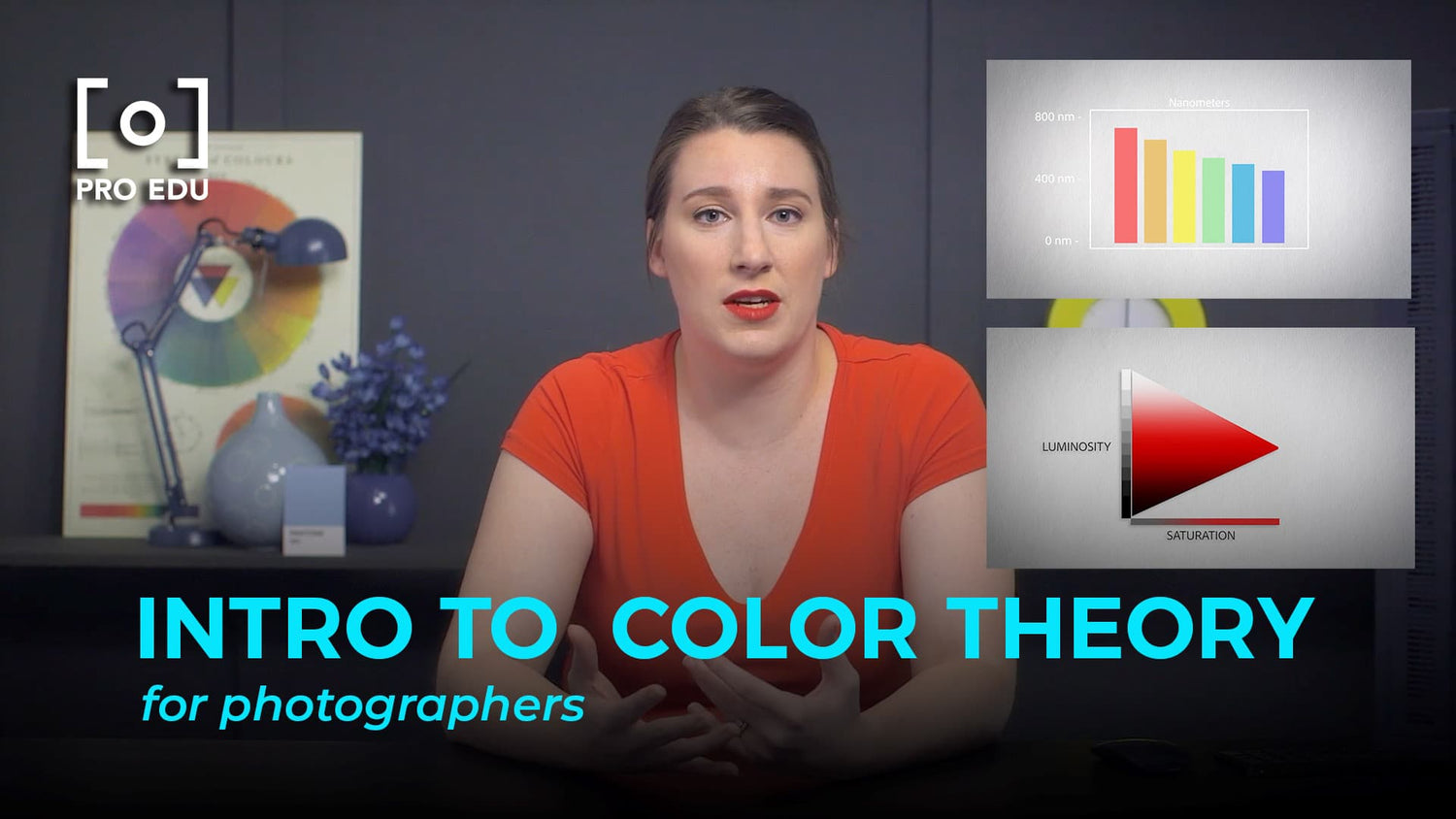
The Art of Color Grading: Mastering the Visual Mood in Photography
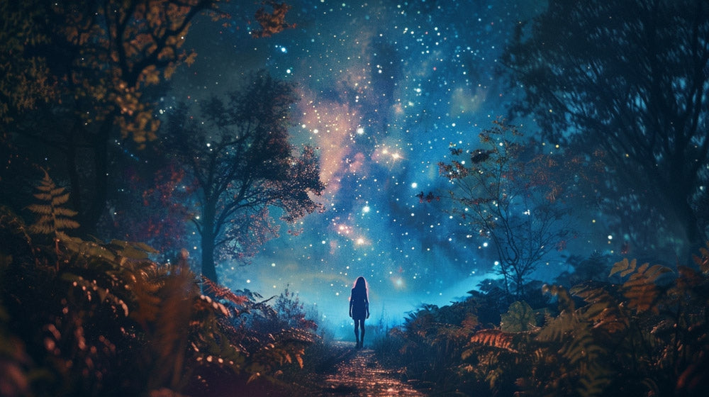
Color grading stands as a pivotal aspect in the transformation of visual storytelling, offering an expansive palette with which we paint emotions and set the mood in our photographic compositions. Through meticulous manipulation of hues, saturation, and light, we can impart a sense of time, enhance narrative depth, and evoke specific emotional responses from the viewer.
This practice is not solely reserved for the realm of cinema; it has also found a significant place in photography, where the art of color grading helps in shaping the visual coherence and the overall aesthetic of a series or body of work.
Part 1 from the Science Of Color Course with Kate Woodman
The Art of Color Grading: Mastering the Visual Mood in Photography
Color grading stands as a pivotal aspect in the transformation of visual storytelling, offering an expansive palette with which we paint emotions and set the mood in our photographic compositions. Through meticulous manipulation of hues, saturation, and light, we can impart a sense of time, enhance narrative depth, and evoke specific emotional responses from the viewer.
This practice is not solely reserved for the realm of cinema; it has also found a significant place in photography, where the art of color grading helps in shaping the visual coherence and the overall aesthetic of a series or body of work.
Understanding the subtleties of color theory is a fundamental step in mastering color grading, allowing us to construct imagery with harmonious color schemes or dramatic contrasts that serve our creative vision. Coupling this knowledge with the technical prowess in various color grading tools and software propels our ability to refine our photos, pushing them beyond the boundaries of the camera's capture. The journey through color grading is a confluence of art and technology, where we learn to bend the science of color to the artistry of our storytelling.
Key Takeaways
- Color grading is essential in setting the mood and enhancing the narrative in both photography and cinema.
- Mastery of color theory and technical knowledge is crucial to successful color grading.
- The application of color grading influences viewer perception and elevates the emotional impact of an image.
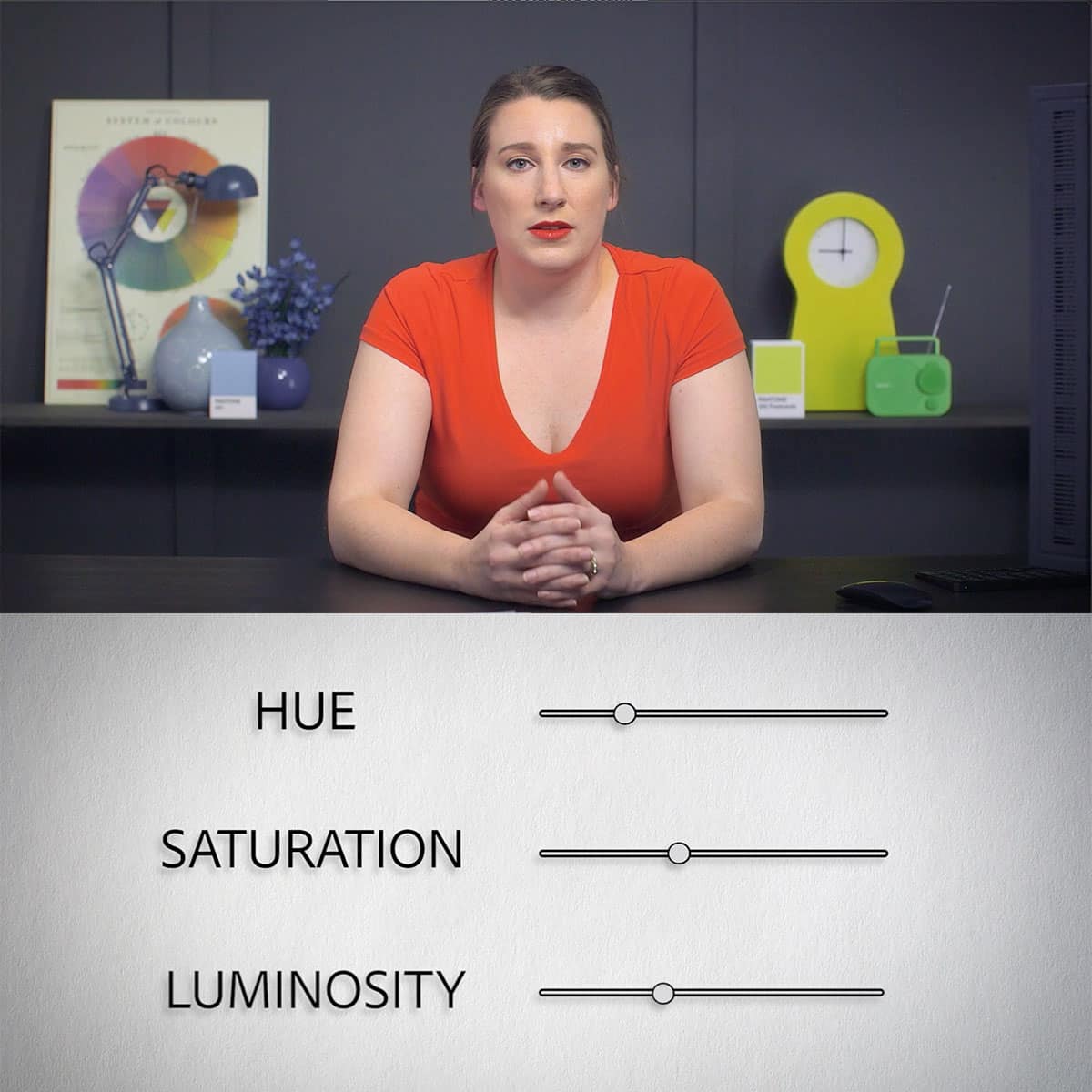
Understanding Color Theory
Before delving into practical applications, we must grasp the conceptual underpinnings of color theory, which are grounded in both the emotional impact of colors and their scientific relationships. Our exploration begins by understanding the dual nature of color as both an artistic and psychological tool.
Fundamentals of Color Psychology
Color psychology plays a pivotal role in our photographic journey, as each hue represents a spectrum of emotions and cultural significances. It's crucial for us to acknowledge that red may evoke feelings of passion or urgency, while blue often conveys a sense of calmness and trust. The impact of color psychology transcends mere aesthetic choices, directly influencing the mood and emotion within an image.
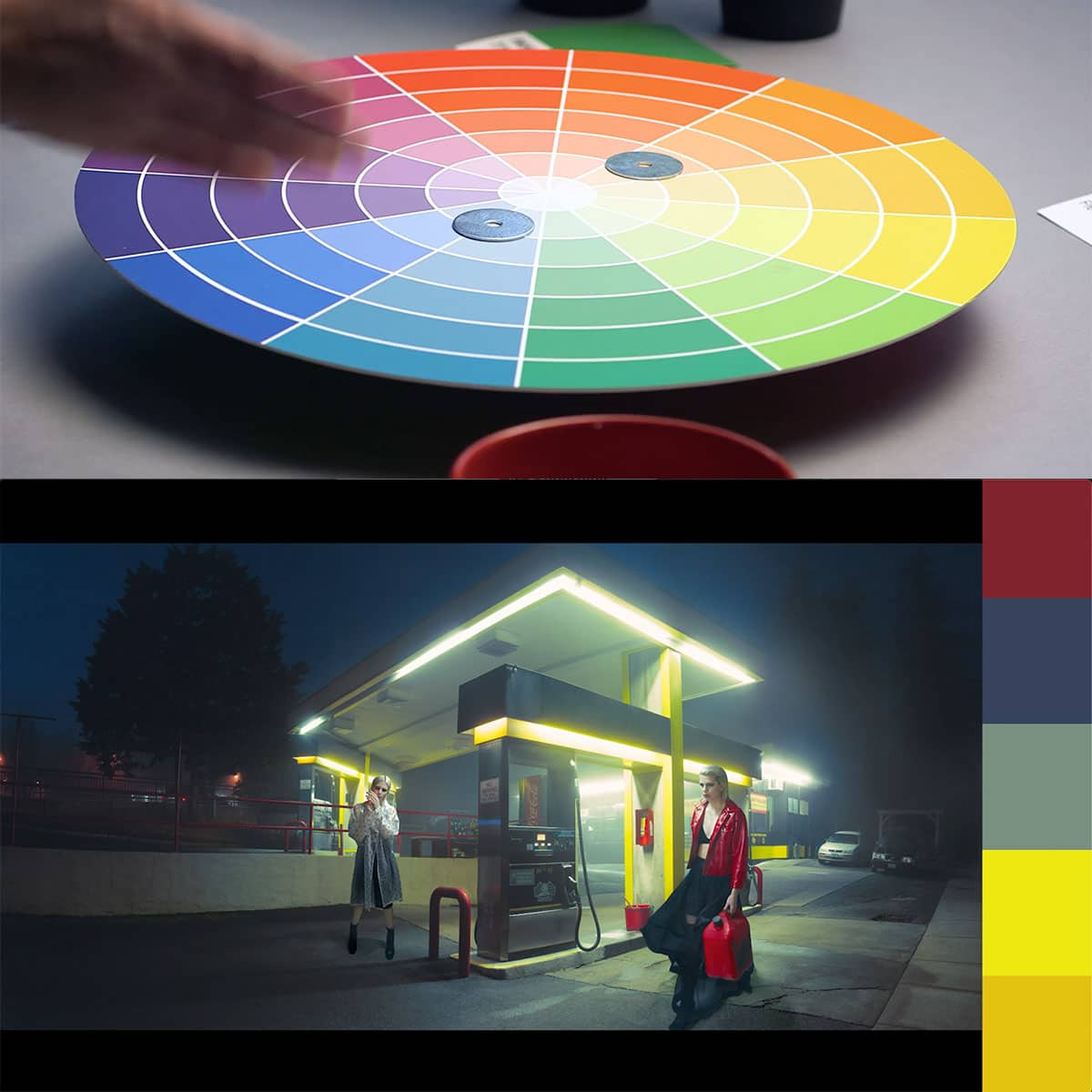
The Color Wheel and Color Relationships
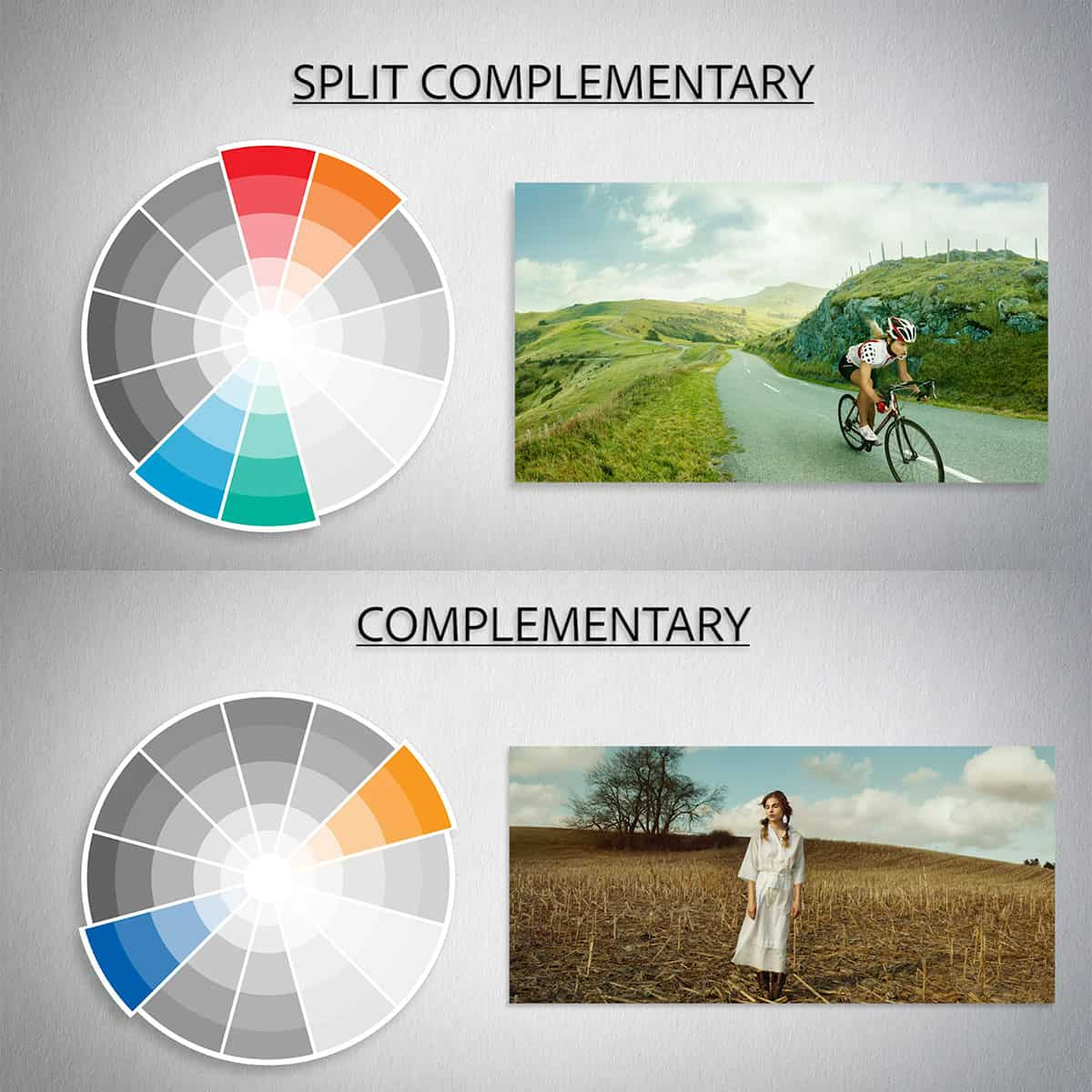
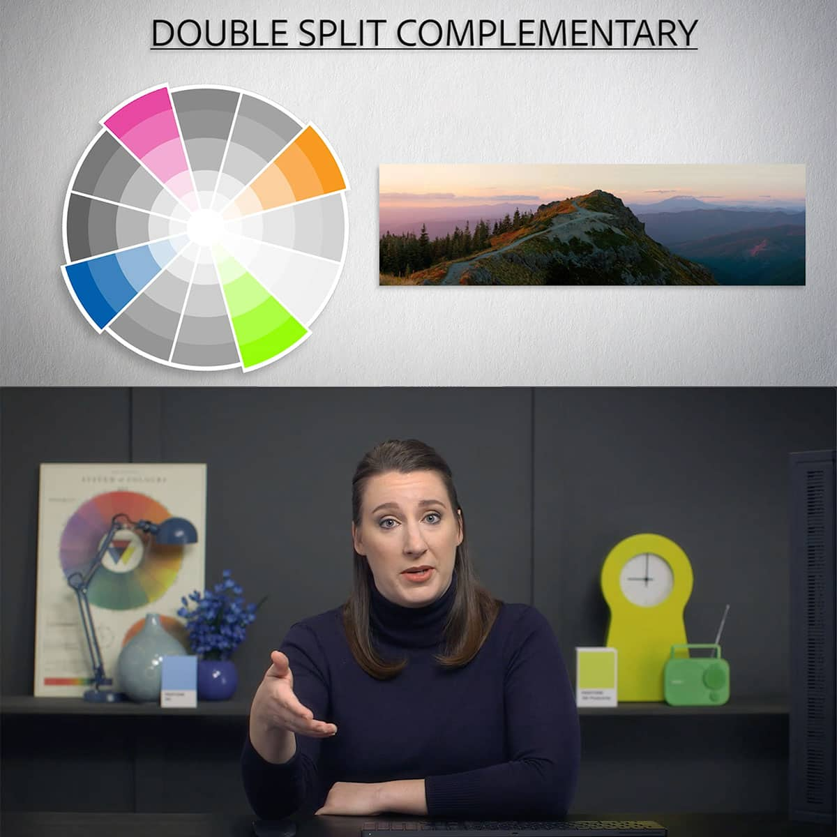
An instrumental tool in mastering color theory is the color wheel, where we see complementary colors (opposite each other on the wheel) create dynamic contrasts, while analogous colors (adjacent to each other) ensure harmony and subtlety. Our knowledge of the color wheel allows for intentional adjustments in hue, steering the color temperature warmer or cooler to craft the desired atmosphere. Understanding this framework empowers us to apply these principles effectively to enhance the storytelling power of our photographs.
The Technical Side of Color Grading
In the realm of photography, mastering the technical side of color grading is essential for us to elevate the visual impact of our images. Understanding the intricate processes and tools at our disposal enables us to precisely shape the color narrative of our work.
Color Grading vs. Color Correction
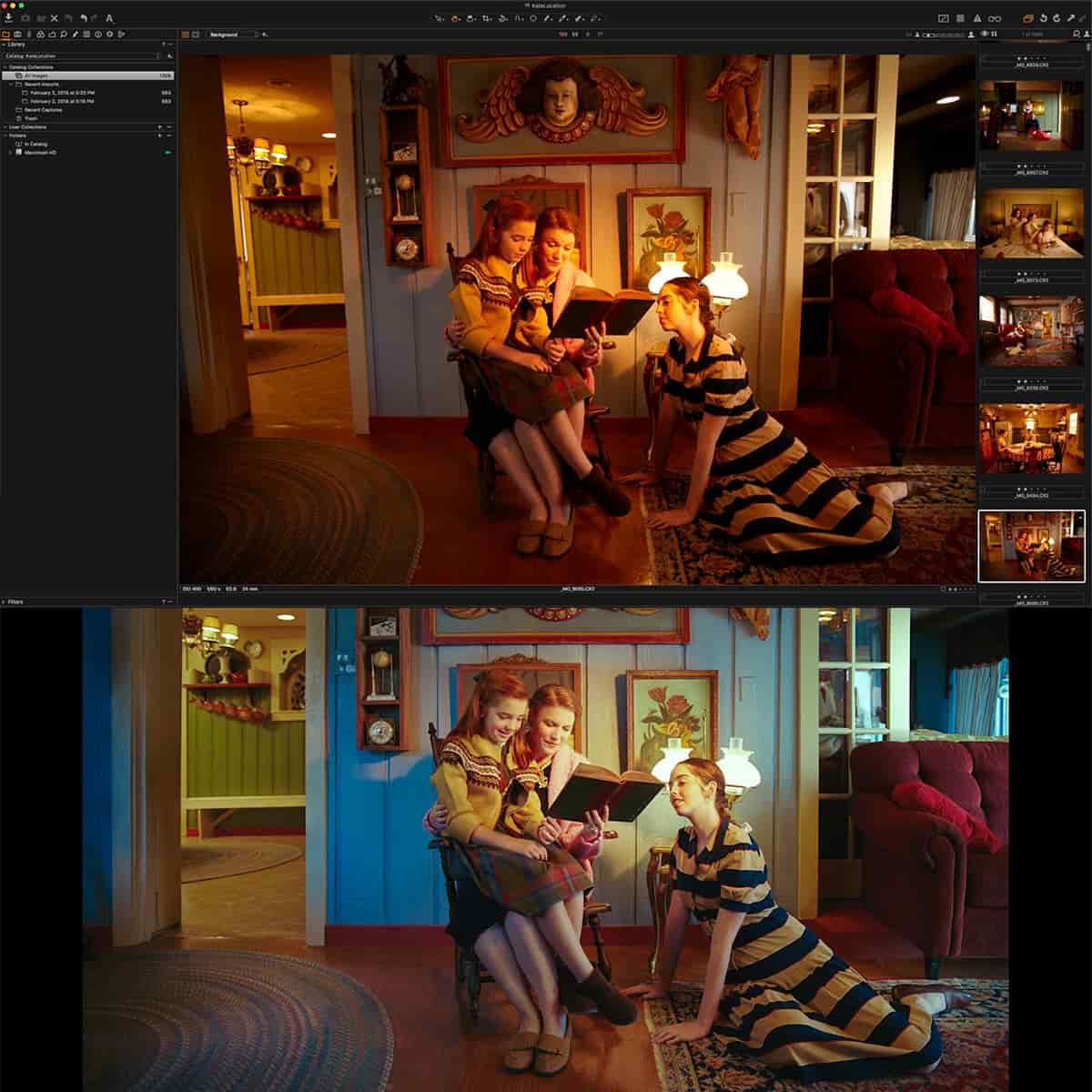
Color grading and color correction may seem similar, but they serve distinct purposes in our workflow. Color correction is our first step, where we adjust the white balance, exposure, and contrast to fix any issues inherent in the raw image. It's about achieving a neutral starting point. On the other hand, color grading is an artistic tool. Here we apply creative stylistic adjustments to color, brightness, and saturation levels to evoke specific moods and themes.
Understanding the Histogram and Scope
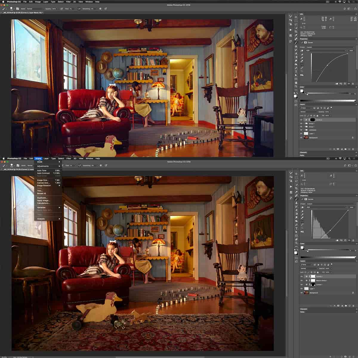
The histogram provides us with a graphical representation of the tonal distribution in our image. Reading this correctly informs us how to manipulate the shadows, highlights, and mid-tones using levels and curves in tools like Photoshop or Lightroom. Simultaneously, using the scope helps us to ensure our adjustments fall within the desired color gamut and maintain a balanced look across the image.
White Balance and Color Matching
Proper adjustment of white balance is crucial for color matching, particularly when we’re merging photos from different sources. It ensures that the white in the images truly appears white, which lays the groundwork for consistent coloration throughout. In professional software like Photoshop, we can work in LAB color space to fine-tune white balance with precision or match colors based on lighting conditions to keep the color temperature coherent across a series of photos.
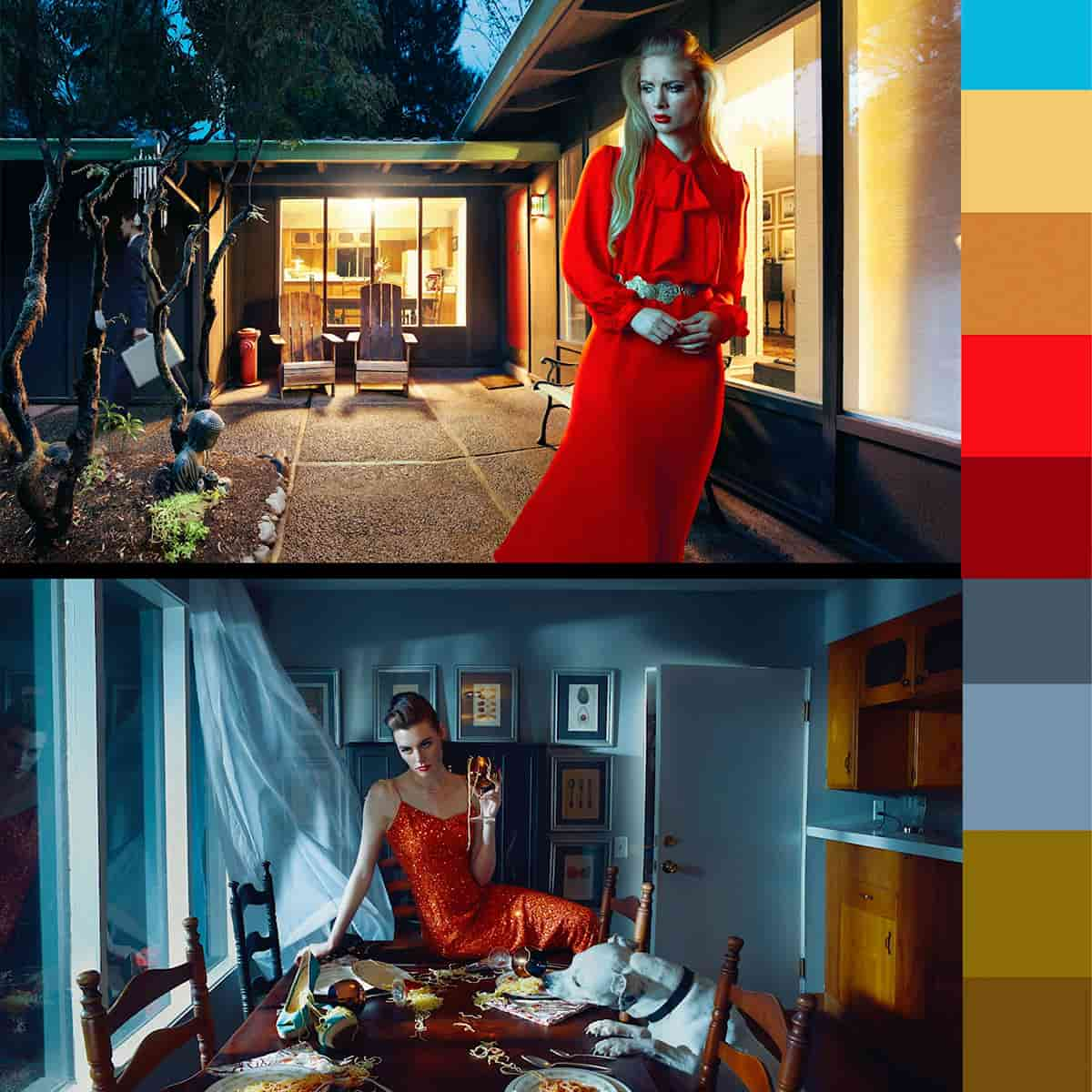
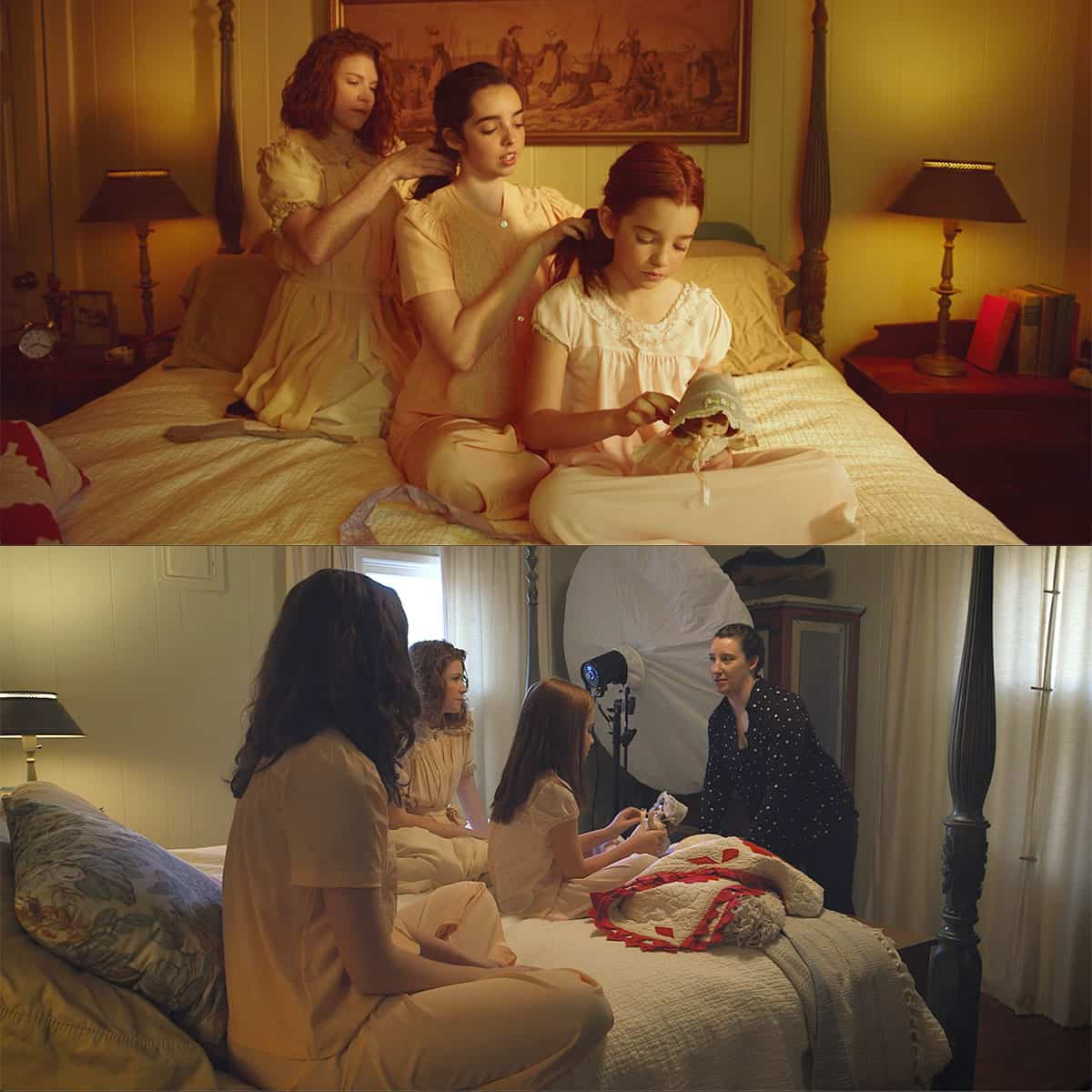
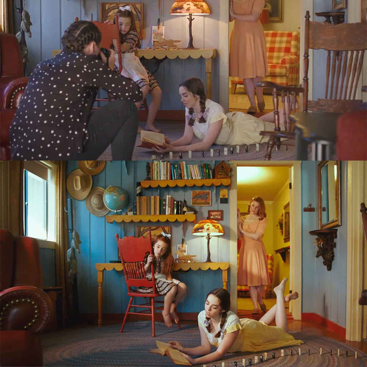
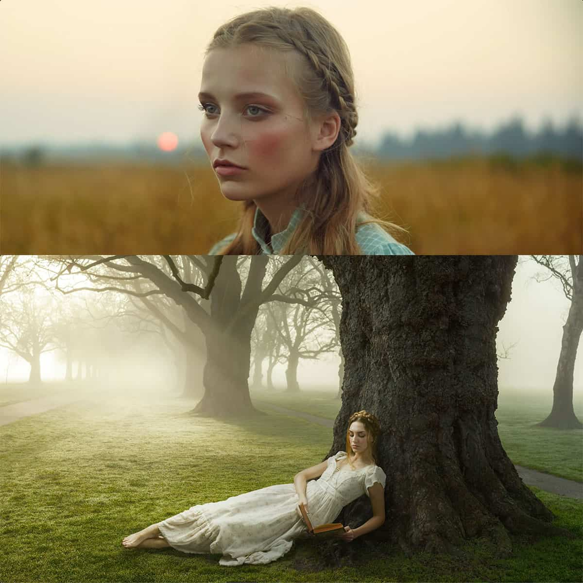
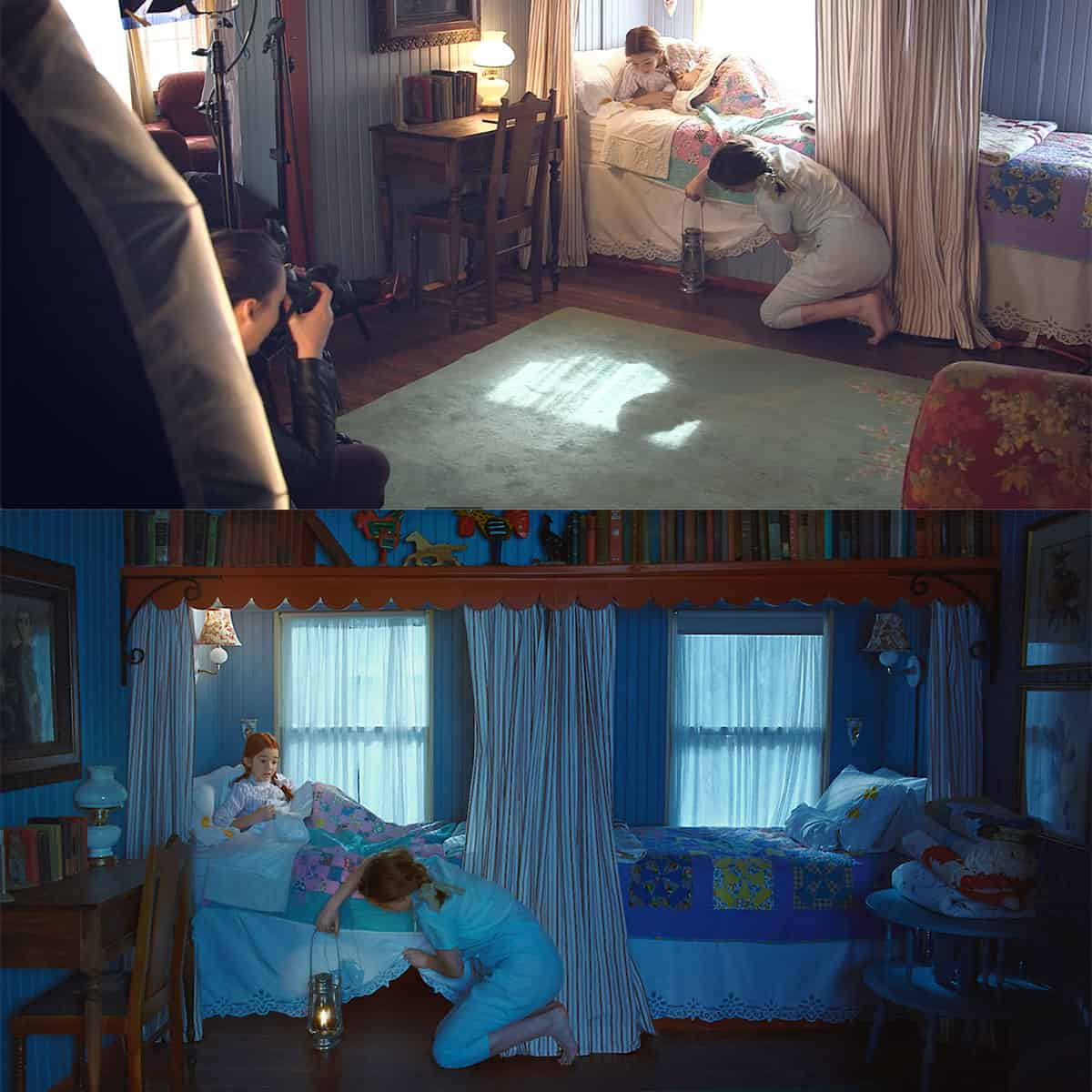
Color Grading in Photography
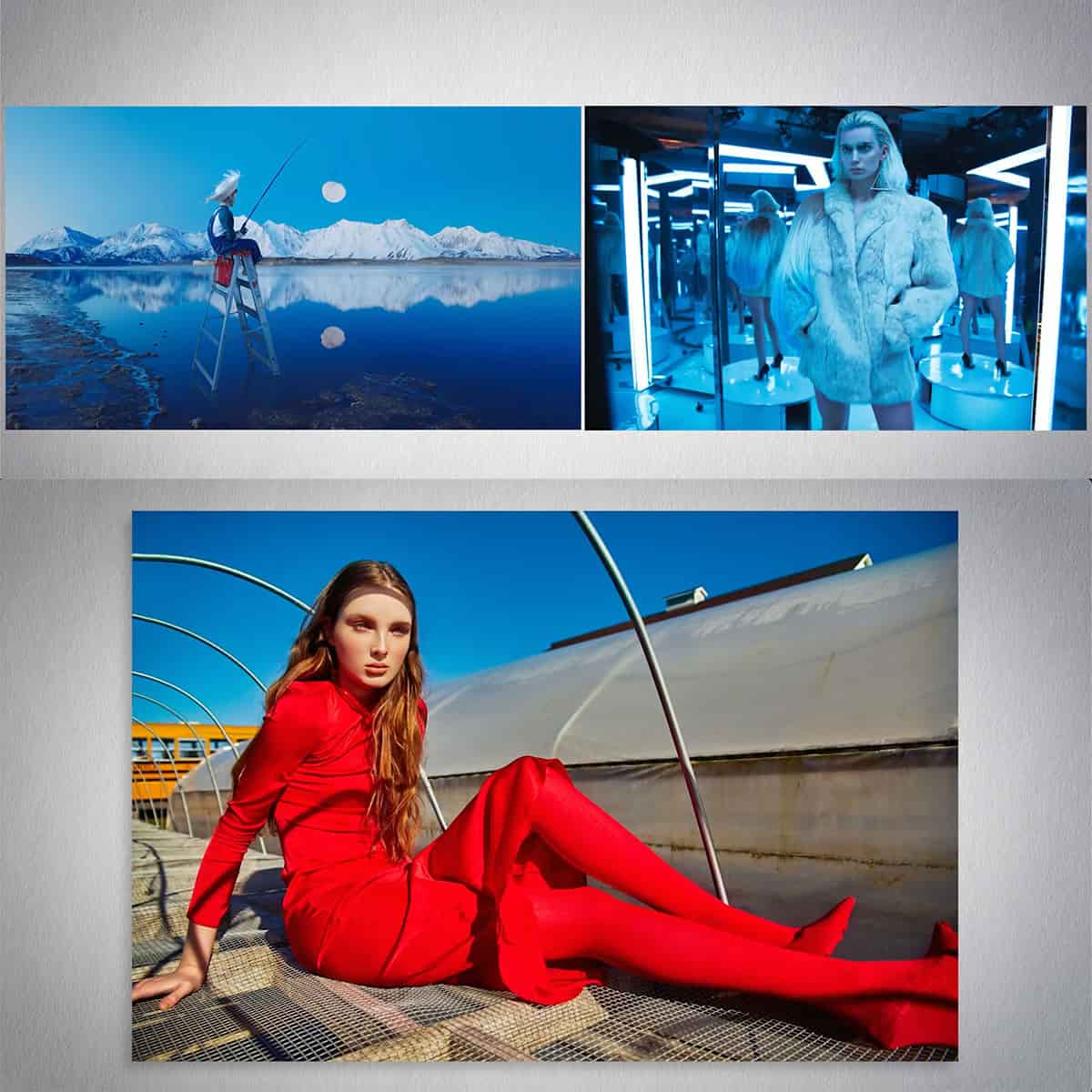
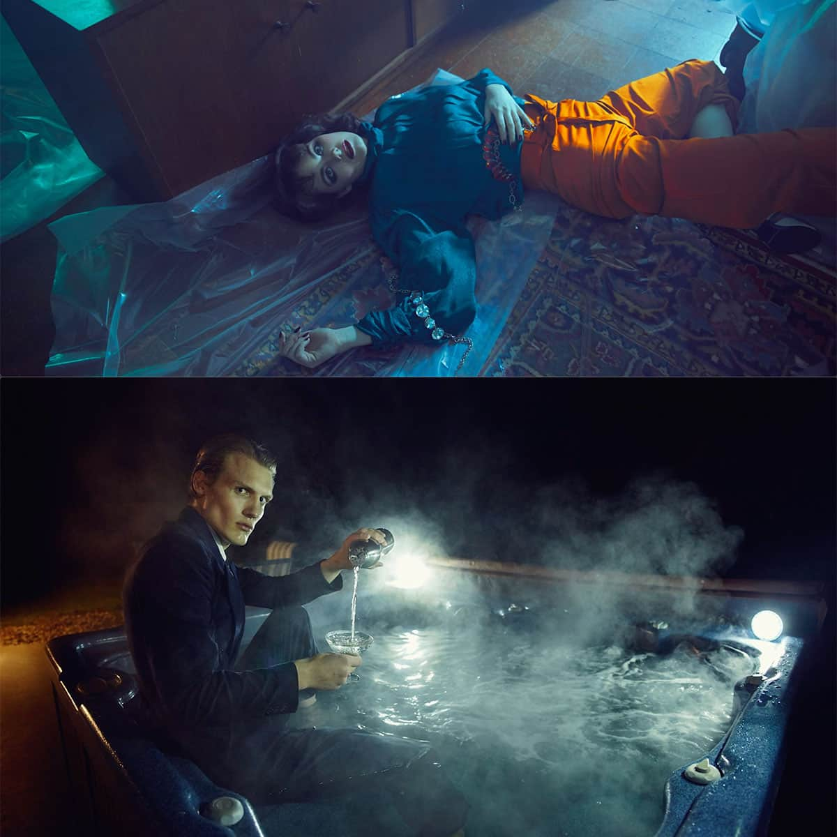
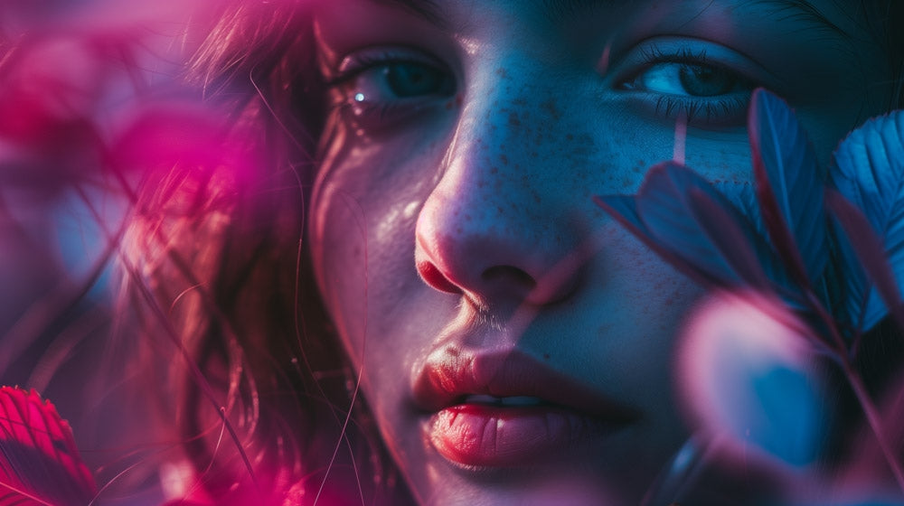
Color grading transforms the emotional impact of an image by adjusting tones and colors. Through this technique, we can steer the viewer's perception and solidify the narrative we wish to convey.
Achieving the Right Mood and Tone
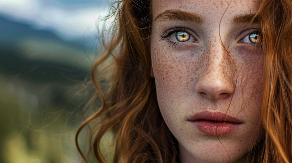
Mood and tone are the soul of a photograph. By manipulating colors in an image, we not only enhance its visual appeal but also imbue it with emotion. For instance, cool tones often convey a sense of calmness or melancholy, while warm tones can evoke feelings of joy or nostalgia.
- Cool Tones: Often used to express sadness or detachment
- Warm Tones: Convey warmth, comfort, or excitement
Working with Light: Shadows and Highlights
The interplay between shadows and highlights defines an image's dimensionality and texture. We use shadows to deepen the sense of space and produce a tactile feeling. Highlights, on the other hand, draw attention to the salient features and textures within the photo. By finessing these elements:
- Deepen shadows to enhance depth
- Boost highlights to emphasize key details
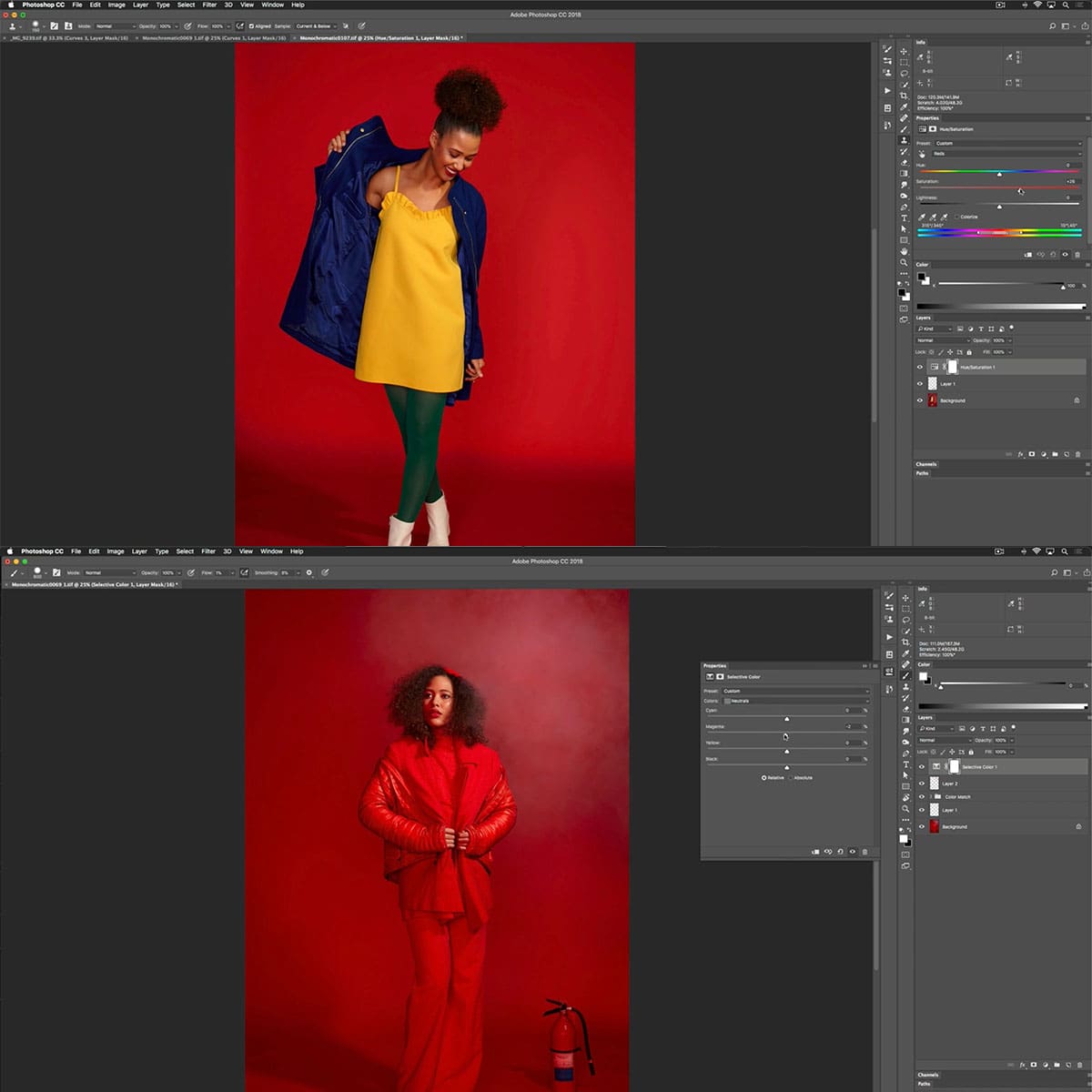
Advanced Techniques: From Split Toning to Selective Color
Split toning allows us to assign different colors to the shadows and highlights, creating a unique aesthetic. This method can emphasize the image's mood or even change it completely. Selective color, a more focused approach, alters only specific color ranges within an image, which can highlight specific elements or create contrasts that weren't originally present.
- Split Toning: Adjust shadows and highlights with contrasting hues
- Selective Color: Alter specific hues without affecting the whole image
Our mastery of color grading techniques gives us the power to not only correct but also to stylize our photographs, ensuring that the images we present tell the story we intend, with the exact mood and aesthetic we envision.
Tools and Software for Color Grading
In the realm of photography, the right tools and software are crucial for color grading. They can transform a good image into a visual masterpiece by enhancing mood, style, and emotional impact. Let's explore some of the key solutions professionals and enthusiasts alike turn to.
Professional Software: DaVinci Resolve and Adobe Photoshop
DaVinci Resolve has emerged as a front-runner in the world of color grading for video, renowned for its advanced colorist tools and high-quality output. It's a comprehensive editing platform that caters to nuanced color adjustment, with a wide array of features for color correction and grading at a professional level.
Adobe Photoshop stands tall for still images, offering a plethora of color adjustment tools within its ecosystem. Photoshop's versatility allows us to manipulate colors down to the finest detail, whether it's through Curves, Color Balance, or more advanced features like LUTs (Look-Up Tables) and color channels.
Mobile and Desktop Alternatives: Snapseed and Others
While professional-grade software can be complex, there are more accessible options that provide quality results. Snapseed is a popular choice for photographers who need a reliable mobile app with a user-friendly interface for quick edits on-the-go. It includes a solid range of editing features, from basic tweaks to selective color adjustments.
For those who prefer a desktop application, Capture One is another excellent option that caters to photographers looking to finely tune their images. It boasts a robust set of color grading tools tailored for precision, offering a similar level of control as Photoshop but with a focus on raw image processing.
The Rise of AI in Color Grading Software
The integration of Artificial Intelligence (AI) is revolutionizing color grading software. AI streamlines the editing process by analyzing images and suggesting automatic color adjustments. This technology is increasingly present in editing apps, making color grading more accessible to novices without sacrificing the quality professionals expect.
Color Grading in Cinema and TV
Color grading shapes the visual mood and style of our cinematic experiences. Through meticulous adjustment of colors, a film can evoke emotions and translate the director's vision.
The Role of the Cinematographer and Director
In filmmaking, the collaboration between the cinematographer and the director is crucial in defining the visual narrative. We understand that the cinematographer, also known as the director of photography (DP), is responsible for capturing the visual essence of the screenplay. It is during post-production that color grading comes into play, a process where both the DP and the director make decisive choices that cement the film's visual style. For instance, a decision to warm up the color temperature can make a scene feel more intimate, while a cooler palette can evoke detachment or desolation.
Historic Techniques to Modern Day: Technicolor to ACES
Historically, processes like Technicolor established the foundation for color in film by using dye-transfer techniques to enhance the vibrancy of movies. Our journey from Technicolor to the modern ACES (Academy Color Encoding System) reflects a continuous evolution in how we present color in cinema.
Technicolor, for example, was responsible for the rich, saturated colors seen in classics like The Wizard of Oz. Today, ACES provides us a standardized workflow that preserves the director's creative intent across different display formats, from the cinema screen to your home TV. By employing ACES, we ensure that colors rendered in post-production remain true and consistent, delivering the exact visual style the filmmaker intended.
Meanwhile, color grading within both cinema and television has reached new heights. With the use of sophisticated software, we are able to manipulate shades and contrasts to a degree of precision that was unimaginable in the era of Technicolor. Our ultimate goal with color grading remains the same: to create a deeply immersive, emotional, and visually captivating experience for every viewer.
Creating a Personal Style
In the realm of photography, the images we present to the world are not just snapshots but rather extensions of our artistic voice. We'll discuss how personal style, through consistency and a unique color scheme, plays a pivotal role in establishing a brand and emotional connection with our audience.
The Importance of Consistency and Branding
Maintaining a cohesive visual style across our work is essential. It strengthens our brand's identity and ensures that our visual language communicates the same taste and aesthetic across different platforms. By doing so, we foster a subconscious association between our images and our distinct style, which resonates emotionally with our viewers.
-
Consistency: Every photo we publish should be an ambassador of our brand. Whether it be the mood, tone, or color, our audience should immediately recognize our hand in the creation.
-
Branding: Branding isn't only for products; it's for artists as well. When we establish a consistent visual style, we essentially craft our brand. This recognition is what sets us apart and makes us memorable in the crowded market of visual content.
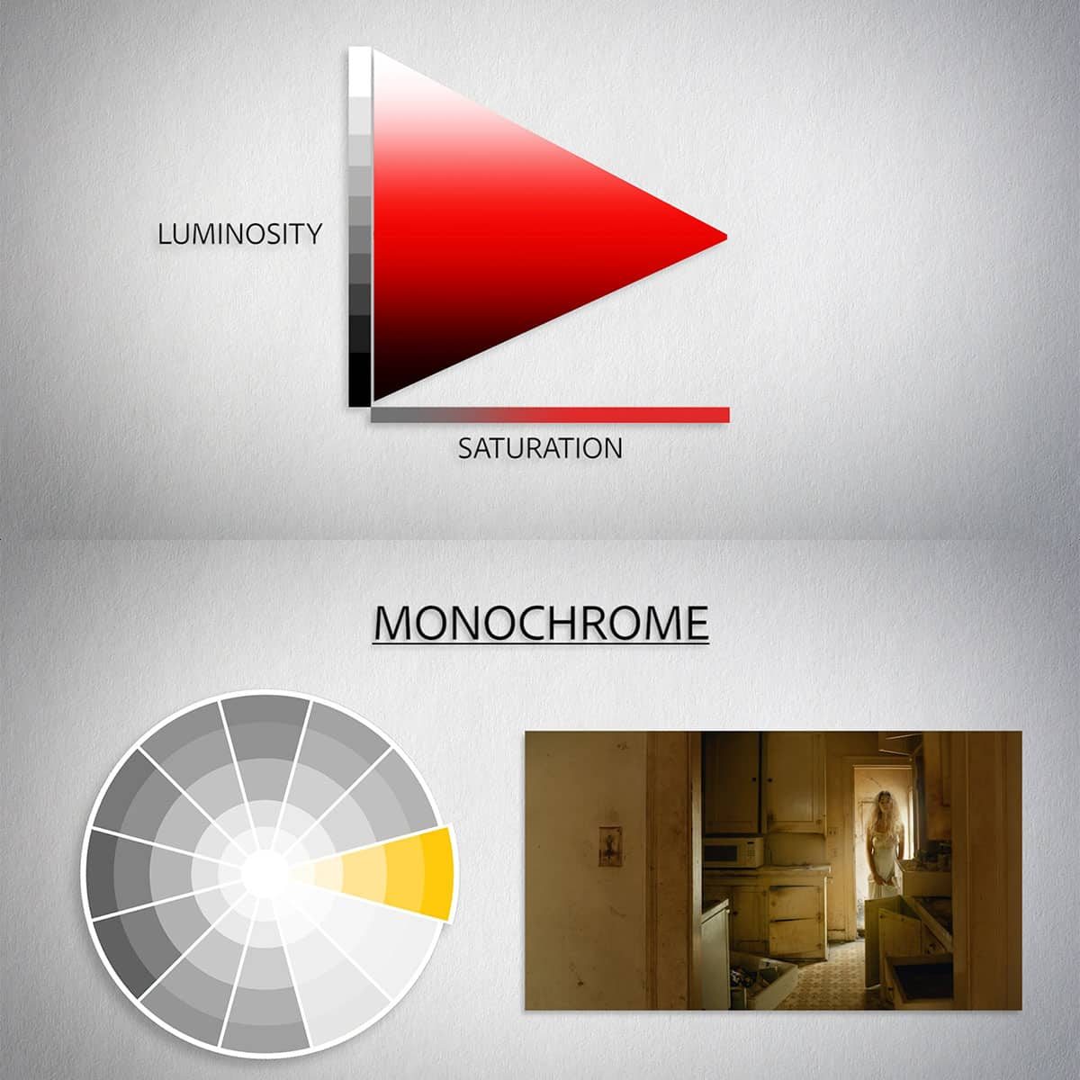
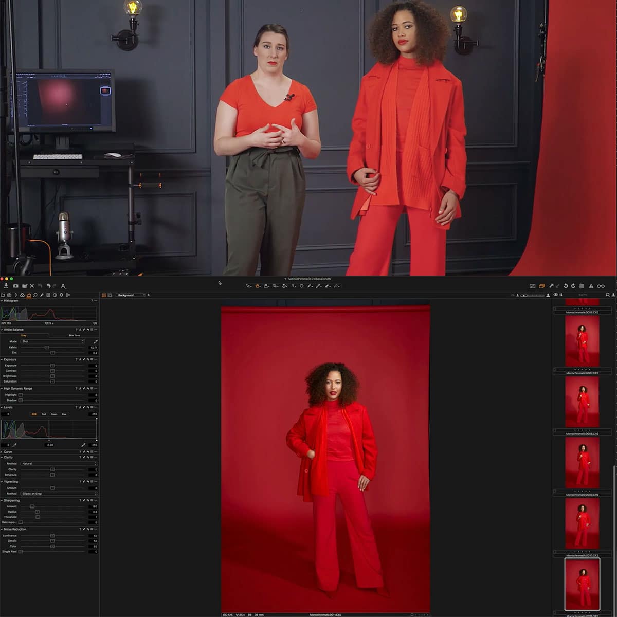
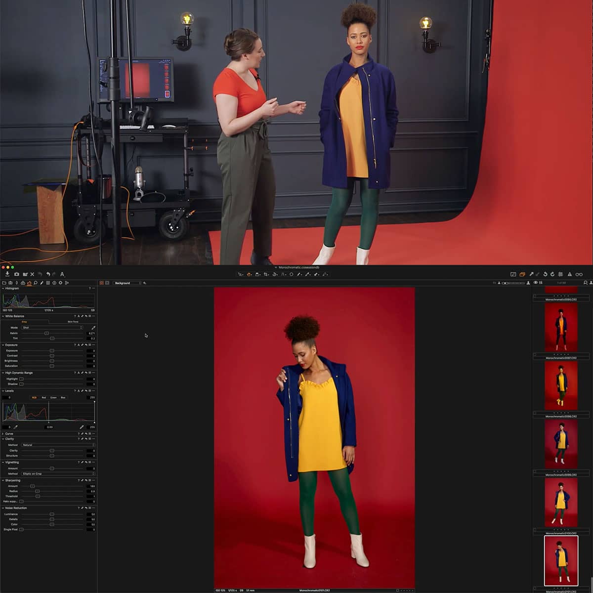
Developing a Unique Color Scheme
Selecting a distinctive color scheme is a powerful tool for defining our visual style. Colors are more than just shades; they carry emotion and meaning. A thoughtfully constructed color scheme can evoke the specific feelings and moods we aim to convey through our work.
-
Color Schemes:
- Monochromatic: Utilizing variations in lightness and saturation of a single color to create a harmonious and balanced effect.
- Complementary: Pairing colors opposite each other on the color wheel to create a dynamic and striking impact.
- Analogous: Choosing colors that are side by side on the color wheel; known for being pleasing to the eye and creating a serene and comfortable design.
Our selection of colors should reflect the taste and emotion we wish to convey, setting the tone for our body of work. This unified color approach across our portfolio not only sharpens our aesthetic but also strengthens the emotional thread that binds our photographs together.
The Impact of Color Grading on Viewer Perception
We understand that color grading is not just about beautifying images; it's a powerful tool to shape viewer perception. Through careful manipulation of colors, we can guide the audience on a visual journey that aligns with the narrative and emotional arc of our story.
Using Color to Tell a Story
We use color grading to enhance the narrative elements of our visual content. By adjusting hues and tones, we can introduce or change the atmosphere of a scene. For instance, warm tones often signify happiness or nostalgia, while cooler tones can suggest sadness or tension. Our ability to alter these nuances helps us to control the pacing and focus of the story. Strategic choices in a palette can also emphasize important plot points, leading to a more immersive storytelling experience.
Influencing Audience Emotions
The practice of color grading goes beyond aesthetic appeal and delves into the realm of color psychology. We can influence the audience's emotions by choosing colors that induce specific feelings. Saturated colors may imbue a scene with vibrance and energy, while desaturated colors might evoke a sense of bleakness or despair. By adjusting contrasts and color balances, we craft an emotional landscape that resonates with viewers, often on a subconscious level, enhancing the overall emotive power of our content.
Frequently Asked Questions
In our journey through color grading, we encounter questions that hone our skills and deepen our understanding of this crucial aspect of photography and film.
How can one apply color grading techniques to enhance photography?
We use color grading to bring out emotions and set the tone of our photographs. By manipulating hues, saturation, and luminance, we can dramatically alter the mood and impact of an image. For tips on enhancing photos through color grading, explore this guide by Boris FX.
What are the fundamentals of color grading for film and video?
The fundamentals of color grading for film and video include understanding color theory, the emotional impact of colors, and the technical use of scopes and waveform monitors. To effectively tell a story, one must master the delicate balance between artistic vision and the technical aspects of color grading.
What tools and software are considered industry standard for professional color grading?
Professional color grading often involves tools and software like DaVinci Resolve, Adobe Premiere Pro, and Final Cut Pro. These offer advanced features that cater to the high demands of industry professionals and are widely used for their comprehensive color grading capabilities.
Can you describe the process of achieving neutral color grading in images?
To achieve neutral color grading in images, we first perform color correction to ensure accurate representation of colors. This sets a balanced starting point, after which we can apply subtle color enhancements without biasing the image toward any particular color palette.
How does color harmony affect the mood and storytelling in photography?
Color harmony is elemental in photography as it directly influences the viewer's emotional response. By using complementary colors or analogous schemes, we can create a sense of peace or drama, aiding the visual storytelling in our photographs. Understanding color harmony enables us to guide the viewer's experience and enhance narrative depth.
What steps are involved in replicating color grading styles from one photo to another?
To replicate color grading styles from one photo to another, we start by analyzing the color palette and grading techniques used in the original photo. Then, we manually adjust the color settings of the other photos to match or use presets and LUTs (Look-Up Tables) to apply similar grading efficiently. Consistency in color grading across images is key to maintaining a uniform style, which could be observed through the resources provided by SmugMug.


