
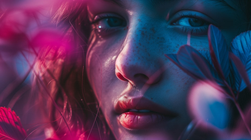
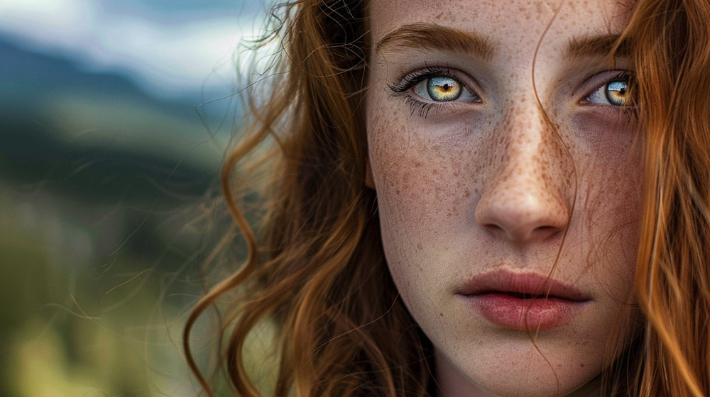
When you look at Kate Woodman’s work it’s easy to see a series of stills from a movie. With a science and engineering background, she ‘accidentally’ fell into the field of photography with a passion for the science and theory of color.
Kate’s talented at bringing people together to show their relationships and loves to shoot people, fashion, and commercial work. But no matter what she’s shooting she always incorporates an incredible concept and immaculate color harmony. You’ll discover trends of conceptual, moody, or darker images in her portfolio.
Color has infiltrated her work in a really conscious way, and as she’s organically grown her technical skills in photography, she’s now confidently sharing the keys to her success through PRO EDU.

In her tutorial, The Science Of Color, Kate looks at the theory, fundamentals, and advanced practices of color use, meaning, and workflow for portraiture storytelling. Here are a few takeaways from the 25 video tutorial.
Properties of Color
There are 3 properties of color hue, saturation and luminosity which are common terms that you’ve seen in Photoshop.
- Hue is usually what we think of when we think of colors.
- Saturation is the intensity or vividness of a hue. A highly saturated image feels lively and energetic.
- When you reduce all of the saturation out of an image, you’re left with a black and white image which is essentially its luminosity. When you increase luminosity you’re adding white to a color, which is referred to as tinting. Conversely when you decrease luminosity you’re adding black and this is referred to as shading. Anything in the middle, such as grey, is referred to as toning.
All of these properties of color are related to each other. For example when you change hue, you’re also changing luminosity.
To better understand luminosity adjustments, watch this free section from The Science of Color tutorial. Kate uses a different technique besides Luminosity Masks in Photoshop to create her unique look. Watch as she plays with sliders to change the luminosity of the yellows, reds and blues in the living room scene and balances the luminosity contrast between colors.
Luminosity Adjustment Video
If you want a more detailed look into how Kate adjusts the luminosity of colors in her images using a Black & White layer to get that painterly effect, this is a video where she screen-captured that workflow from Photoshop. The concept would be the same for luminance sliders in Lightroom, just without the presets.
Using the Black & White Layer to Adjust Color Luminosity Video
Color Harmony
Now, let’s talk a bit about putting colors in same space to create color harmony. This isn’t mixing colors to get different colors, this is a concept originally pioneered by Johannes Ittens, a 20th century color theorist who came up with the notion that we have 7 color harmonies that we all resonate with. As a result, he wrote a book called The Art of Color and was a major contributor at Bauhaus, Germany’s most influential art school in the 1900’s.
Here are examples and descriptions of the 7 color harmonies.
- Monochrome Color Harmony
- Complementary Color Harmony
- Split Complementary Color Harmony
- Double Split Complementary Color Harmony
- Quadratic (or Square) Color Harmony
- Triadic Color Harmony
- Analogous Color Harmony
Monochrome Color Harmony
Monochromatic color contains all of the colors in a single hue. In this example, the image is using different tones, tints and shades of yellow.

Complementary Color Harmony
If you add an additional color that is on the opposite side of the color spectrum. The high contrast of these two colors adds visual interest to any scene. The color examples in this image are blue and orange.

Split Complementary Color Harmony
A slight variation to the complementary color harmony is split complementary which is two colors on either side of colors’ complement. This harmony is an easy choice for beginners in color theory because it’s hard to go wrong, and almost always looks stunning.

Double Split Complementary Color Harmony
When two complementary pairs are directly adjacent to each other we call this double split complementary color harmony.

Quadratic (or Square) Color Harmony
If you push four colors out so that they’re evenly spaced around the color wheel then you’ve made a square or quadratic color combination. This harmony is comprised of two complementary pairs, but specifically pairs equidistant around the wheel.

Triadic Color Harmony
When you remove one of those colors, so you’re back down to three colors, evenly spaced around the wheel. You’ll conveniently notice that primary colors and secondary colors make up a triadic color harmony which is a reason this is also a simple first choice for beginner photographers dabbling in color theory.

Analogous Color Harmony
Four colors that are directly next to each other on one side of the wheel make up the analogous color combination. Make note that the colors may or may not be directly adjacent but they are close enough that it creates a wedge shape out of the pie of the color wheel.

Psychological Effects of Color on Emotions
Modern color theory also tells us that certain colors can be associated with different emotions. Kate’s photography often elicits an emotional response, and many times it can be traced back to the colors that she’s using to create a painterly effect.

Blue
The color blue can remind us of trust and faithfulness. For example we depend on those in uniform for protection and reliability. It can also cause us to feel solitude, remoteness or tranquility because of its association with our natural environment, like the skies and seas.
Brown
The color brown is a metaphor for the element earth and all that it encompasses, including animal life. A primitive color rooted deeply in the ground that reminds us of humility, simplicity, and the common people.
Green
The color green can swing between two feelings. Due to its association with nature it is a promise of life, health and a feeling that a system is turned on. It’s also prevalently associated with toxicity and poison, most often contributed by feelings of greed or envy.
Orange
The color orange is often associated with amusement and entertainment. It’s lively and inspires risk taking or courageous activities. It’s very visible because of its contrast to our blue skies and colors so it’s often used as a safety color.
Purple
The color purple is the deepening of pink, transferring it from sweet and feminine to deeply erotic. Celebrate and liberates the oppressed by blending masculine blue and feminine pink. It brings out emotions of fantasy, science fiction, mystery and things unattainable.
Red
The color red is the color of our blood. In ancient times it meant life, health, victory and vitality. It elicits emotions from us such as enthusiasm, libido, rage, aggression, and agitation. Almost conversely it creates a sense of burning, fire, love and lust inside us.
White
The color white brings about feelings of purity, sacrifice, chastity, grace and virtue. We often bleach things to make them whiter and/or more sterile, stemming from our association with coldness and sterility of ice and snow.
Styling, Casting, Posing and Lighting
As a photographer, it’s important to learn how to build color into your images as the driving force for mood, emotion and storytelling.
Styling can be a huge part of that when you’re coming up with your narrative or portraiture development. Use the following examples to understand the color decisions that are going through Kate’s head as she is analyzing an image and making critical choices where she can take the image in this next video.
Styling For Your Story Video
In this excerpt, Kate talks to Trudy, her on set stylist, about how she wants a classic timeless aesthetic versus a period piece for this set. For the actresses who are playing sisters and a mom, Kate’s adding complexity and visual interest with her clothing, hair and makeup choices.
And, of course, she takes a hard look at the color choices. Kate’s goal is to take an existing palette and match it to the palette she has in the set location -- whether it’s the neutral bedroom scene, complementary-colored living room scene, or the grand pops of color in the kitchen scene.
In the end, Kate plans the location, styling and color so that it fits cohesively to look great together as a strong narrative photography collection.

The Science of Color Tutorial includes over 3 hours of content to help you learn to build color ito your images as the driving force for mood, emotion and storytelling. You can get it here:
Kate’s new tutorial Narrative Photography will be released on July 30. Whether you’re a commercial photographer, working on a personal project, or specializing in portraiture or landscapes, narrative photography is the answer that will add complexity and depth to your work. It’s a great follow up to Science of Color because it goes into more of how Kate stages and lights her sets.
The 3-hour advanced tutorial uses Photoshop and Capture One. It will be available for streaming and download on July 30. You can get 2 free sections of this tutorial and one of the color actions that Kate uses in the tutorial for free here.
By the end of Narrative Photography tutorial, you’ll feel confidence to forge inspiration, conceptualize your ideas, and execute your plan to see it all come together in post production editing.


