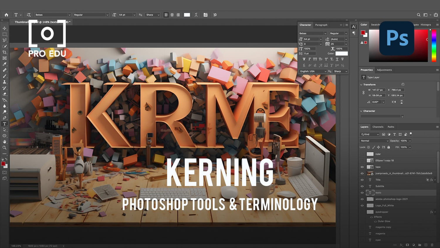
What Is Kerning In Photoshop: A Concise Guide for Designers
As designers, we often strive for visually appealing and readable text, which is where kerning comes into play. Kerning is the process of adjusting the space between individual characters in a line of text, allowing for a more balanced and aesthetically pleasing appearance. Whether working on a logo, headline, or body text, proper kerning is essential for clear and professional design.

In design software like Adobe Photoshop, kerning is a fundamental aspect to consider. Photoshop offers various tools and options for adjusting kerning, allowing designers to fine-tune the spacing between specific characters. Having a good understanding of kerning principles and applying them in Photoshop can dramatically enhance the overall look and feel of your designs.
By practicing and mastering kerning techniques in Photoshop, you can significantly improve the readability and visual appeal of your typography. Remember to always stay mindful of kerning while working on different design aspects, as it can make all the difference in achieving a cohesive and professional result.
Key Takeaways
- Kerning is vital for creating clear and visually pleasing text in designs
- Adobe Photoshop provides tools to adjust kerning effectively
- Mastering kerning techniques enhances typography's appeal and readability
Understanding Kerning
The Basics of Kerning
Kerning refers to the process of adjusting the space between individual letters in a piece of text to achieve a visually pleasing and readable result. It plays a crucial role in typography and graphic design, since it can greatly affect the overall appearance and readability of the text1. In kerning, we add or remove space between two particular letters, while leaving other letters in the word unaffected2.
By increasing the kerning value, space will be added between two specific letters. Conversely, decreasing the kerning amount reduces space3. Let us delve into the basics of kerning using a simple table:
| Element | Kerning |
|---|---|
| Purpose | Adjust space between letters |
| Typography Impact | Affects readability and aesthetic appeal |
| Techniques | Increase or decrease space between characters |
Kerning in Typography
Kerning in typography is essential, as it enhances legibility and aesthetic appeal4. When effectively used, kerning can be a powerful tool that influences aesthetic and communication through type. It is so subtle that when used well, it won't be noticed by the average reader5.
Roles of Kerning in Design
In design, kerning plays a vital role in enhancing text readability and aesthetics through expert adjustments. Mastering kerning in applications like Photoshop can elevate your designs to a professional level6. Some of the key roles of kerning in design include:
- Improving readability: By optimizing the space between characters, kerning helps make text more readable.
- Enhancing aesthetics: Proper kerning maintains a visually harmonious distribution of space, contributing to the overall beauty of the design.
- Communicating efficiently: A well-kerned text provides clarity and makes it easier to understand the intended message.
By understanding and utilizing the principles of kerning, we can create more engaging, readable, and visually appealing designs.
What is Kerning in Photoshop
Adobe Products and Kerning
Kerning refers to the process of adjusting space between two letters in a word. Its goal is to achieve a visually harmonious distribution of space between characters, enhancing legibility and aesthetic appeal. In Adobe products like Photoshop, kerning is an essential tool for designers to create visually pleasing text.
Adobe Photoshop allows us to adjust the kerning value, which adds or removes space between specific letters in a line of text while not affecting other letters in a word. This feature is particularly useful for designers who need a high level of control over typography when working on various projects.
Exploring the Photoshop Workspace
The Photoshop workspace provides a variety of tools for designers to manipulate text, including adjusting kerning. In the Character panel, we can adjust the kerning settings for selected text layers.
To adjust the kerning value:
- Select a text layer you want to modify
- Open the Character panel by going to Window > Character
- Adjust the kerning value using the dropdown menu or input field
Working with kerning in Photoshop is an essential skill for any designer who wants to create visually appealing and legible text. By exploring the Photoshop workspace and understanding the importance of kerning, you can significantly improve your design projects.
Adjusting Kerning in Photoshop
Using the Character Panel
When we are adjusting kerning in Photoshop, one of the most popular methods involves using the Character Panel. This panel allows us to make changes to the space between individual letters, improving the overall readability and aesthetics of the text. To access the Character Panel, simply go to Window > Character. From there, we can easily adjust the kerning value by selecting the desired characters and then changing the value in the kerning input box source.
Manual Versus Optical Kerning
There are two main ways to adjust kerning in Photoshop: manual and optical. Manual kerning is when we manually adjust the space between specific letters to achieve a visually harmonious result. On the other hand, optical kerning is an automated process that adjusts the spacing between characters based on the shapes of the glyphs themselves. Although optical kerning is an intelligent and convenient option, it may not always provide the most precise results compared to manual kerning source.
Adjustments and Shortcuts
To speed up the process of kerning adjustment, we can utilize a few keyboard shortcuts in Photoshop. After selecting the text and placing the text cursor between two characters, we can use Alt (Option on Mac) and Left or Right Arrow keys to adjust the kerning quickly. Each press of the arrow keys will either increase or decrease the spacing by a small increment, allowing us to make precise adjustments with ease source.
In conclusion, mastering kerning adjustment in Photoshop is essential for creating visually appealing text and enhancing readability. By understanding the different methods of kerning and using shortcuts, we can efficiently improve our typography skills and create more polished designs.
Kerning Practice Tips and Techniques
Identifying Bad Kerning
One of the primary steps in mastering kerning is being able to identify bad kerning in text. When letters are too close together or too far apart, it can create a jarring visual effect and reduce readability. In order to spot bad kerning, we recommend reading the text and observing where gaps are too small or too large, making the overall word spacing look inconsistent.
Achieving Perfect Kerning
To achieve perfect kerning in Photoshop, we can follow a few simple steps. First, select the text layer and double-click to highlight the text. Then, place the cursor between the two characters you want to adjust. Open the Character Panel, locate the V/A icon, and either choose a value from the dropdown menu or enter a custom value. Positive values will add space between the characters, whereas negative values will reduce it. Experiment with different values to achieve a visually balanced appearance1.
Advanced Kerning Techniques
For more advanced kerning techniques, we can make use of the Optical Kerning feature in Photoshop. This method adjusts the spacing between characters based on their shapes, providing a more visually pleasing result2. To apply Optical Kerning, highlight the text and access the Character Panel. Change the kerning value dropdown from Metrics to Optical. Additionally, professional typographers often manually adjust kerning for specific character pairs, known as kerning pairs, to enhance the overall visual harmony[3]. With practice, you'll be able to fine-tune kerning and elevate your typographic skills.
Kerning in Various Design Aspects
Kerning in Logo and Poster Design
When working on logo design and posters, kerning plays a crucial role in ensuring the text is visually appealing and easy to read. As we adjust the space between specific characters, we create a harmonious distribution that enhances legibility 1. In logos, effective kerning is vital, as it can greatly impact brand recognition and perception.
To achieve visually pleasing kerning in logodesign and posters, use Photoshop's kerning adjustment tools and rely on manual fine-tuning. This will ensure each character pair has an appropriate amount of space, resulting in an eye-catching and well-balanced design 2.
Role of Kerning in Letter Spacing
Kerning and letter spacing both contribute to the overall readability and aesthetics of a text, although they focus on different aspects. While letter spacing (or tracking) affects the space between all characters in a word or line of text uniformly 3, kerning is more focused on the optimal spacing between individual character pairs.
This difference means that we have to consider both kerning and tracking when working on text adjustments in Photoshop. For instance, proper letter spacing ensures consistent visual flow, while kerning fine-tunes space between specific character pairs to achieve a balanced and visually appealing result 4.
By understanding and mastering both kerning and letter spacing techniques, we can create designs with improved legibility and aesthetics, regardless of whether we work on logos, posters, or other text-intensive projects.
Frequently Asked Questions
How to fix kerning issues in Photoshop?
To fix kerning issues in Photoshop, first, select the Text tool and then click between the two letters you want to adjust. Use the Character panel or the options bar to modify the kerning value, allowing you to increase or decrease the space between the specific characters.
What are the differences between kerning, leading, and tracking?
Kerning refers to the adjustment of space between two specific letters, improving legibility and aesthetics. Leading is the vertical space between lines of text, impacting overall readability. Tracking, on the other hand, is the uniform adjustment of space across an entire range of characters in a word or phrase, used for better text balance.
Why is the kerning option greyed out in Photoshop?
The kerning option may become greyed out in Photoshop when the selected text layer uses faux styles, such as bold or italics, or if multiple characters are selected. To resolve this, deselect the faux styles or ensure that only the space between two specific characters is selected.
How to adjust text spacing for better readability?
To adjust text spacing for better readability, consider modifying the kerning, leading, and tracking of your text. Each of these elements contributes to the overall balance and legibility of the text in your design, thus, making adjustments to these values can improve aesthetics and readability.
How does kerning affect design elements in Photoshop?
Kerning can significantly impact the visual harmony, legibility, and overall look of a design in Photoshop. Adjusting kerning values ensures that the space between characters is visually consistent, which enhances the aesthetic appeal and readability of your text-based design elements.
Can I apply kerning to an entire paragraph of text?
Kerning is generally applied between two specific characters to address spacing issues. If you need to apply spacing adjustments to a larger portion of text, such as an entire paragraph, consider using tracking adjustments instead. Tracking affects the overall space between all characters in a selected range, allowing for uniform modifications across the entire text block.


