Strong composition is crucial for good food photography. In addition to lighting and styling, composition is a key factor in appealing food photos.
The so-called “rules” of composition are more like guiding principles. What works for one image won’t necessarily work for another. However, understanding compositional principles and how to implement them can exponentially improve your food photography.
Read on for some of our best food photography composition tips.

Visual Weight and How to Read an Image
Before you can start taking better food photos, you need to understand how our eyes move through an image.
In the Western world, we read text from left to right. Therefore, the viewer’s eye travels through an image in the same way.
The eye moves towards the most significant point of interest and works its way around the scene. The elements with the highest visual weight tend to draw the eye the most.
Visual Weight is an important part of the relationship between the proportions of the various elements in your scene. Something with high or "heavy" visual weight will draw a lot of attention to itself, while at the same time detracting attention from the rest of the image.
In food photography, our subject usually has the most visual weight, while the props and other elements in the scene vie for our attention.
In the image below, the frying pan of mushrooms carries the most visual weight.

Because we experience gravity, we tend to look at a photo with the subconscious assumption that different elements could fall to the ground. This means that our sense of balance affects our reaction to visual imagery. We seek equilibrium and search for balance in everything we see.
In short, when we position an element away from the center of the frame (the center of gravity), the more likely we are to look for other elements to balance it out. This is where our props come in.
Understanding the concept of visual weight will help you better arrange your subject and any supporting elements within your image.
Use Negative Space to Provide Balance and Breathing Room
Positive space is the area taken up by your food subject and supporting elements, like your props. Negative space is the area that is left empty.
Negative space does a lot for a food photo.
It’s an area where your eyes can momentarily rest. It provides balance, a bit of breathing room, and emphasis on the subject.
When there is too much going on in an image, or very little negative space, the viewer is unsure of where to look.
In this case, a lack of negative space can give a sense of claustrophobia.

Negative space can also portray movement and give context to food images. It can lend a sense of narrative that captures the viewer’s eye and brings attention to the details in the food.
Note that in food photography, shooting with a lot of negative space for the purposes of text placement is very common. Examples of this are magazines layouts, product packaging, or many types of ad work.
Start with the Hero
A food photo always has a “hero”.
This is the jargon used by food photographers to describe the main subject—or focal subject.
No matter how minimalist or involved your composition, a food photo should have one item as a focal subject. You can have multiples of the same item, for example, three glasses of chocolate mousse as in the image below, but one of them should be the main point of interest.

That focal subject dictates the placement of the other items in the frame.
A good approach--especially for beginners--is to choose one focal subject and a couple of supporting elements like props when composing your shot.
Pay attention to the size and scale of these items in relationship to one another. Props that are small to the eye can look huge to the camera and take over the image, dwarfing the focal subject.
If you’re using a few props, make sure that they have different sizes, so they counterbalance each other.

Use the Power of Line in Your Food Photos
The concept of Line is the most basic compositional principle. Every image makes use of line on some level.
Lines lead the eye through a photograph and guide us around the image through key focal points and elements that tie a visual story together and give it meaning.
They create movement, motion, and rhythm and provide an image a general sense of balance and harmony.

Lines have an impact on how the viewer’s eye will travel through the composition.
The direction a line leads the viewer through the image has its own subconscious connotation.
Horizontal lines can indicate calmness and stability within an image, while vertical lines suggest power and strength.
Diagonal lines are thought of as being the most dynamic, and are a key element in good food photography composition.
Lines add impact to an image by creating visual interest and patterns. Lines can occur organically in the subject and props but most will be created by placement.

Consider the Phi Grid Over The Rule-of-Thirds
When first starting to learn about photography composition, you’ll come upon the principle of the Rule of Thirds. This is basically an imaginary grid that divides the frame into nine equal sections. The important elements in the scene fall along the grid’s lines, or at the points where they intersect.

The Rule-of-Thirds is a valuable tool in splitting up your frame in a pleasing way and helping you figure out how to place the main elements in your food photos. However, this principle can sometimes be a bit limiting in food photography. Sometimes a more powerful approach is to implement the Phi-Grid.
These grids look almost the same, but the centre lines of the Phi-Grid are closer together.
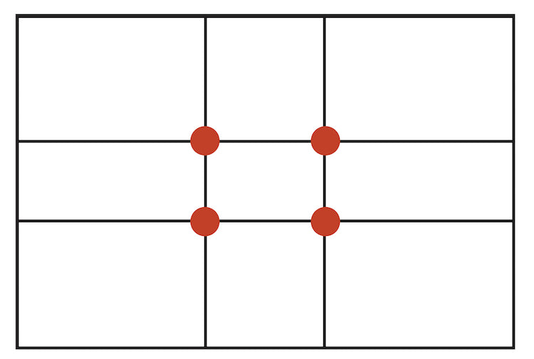
The Phi-Grid is an expression of the Golden Ratio, which is 1:1.168. This is sometimes referred to as the Golden Mean or Divine Proportion.
It’s a mathematical concept that can be used to create a balanced and pleasing composition.
Artists have been applying to Golden Ratio to their work for centuries.
It is said that this ratio appears everywhere in nature, which is perhaps why we tend to gravitate toward it, and why the brain processes visuals incorporating the Golden Ratio more quickly.
In the images of doughnuts below, I cropped the one on the left using the Rule-of-Thirds grid in Lightroom.
I cropped the image on the right using the Phi-Grid.
The difference is small, but the image on the right allows for better movement and flow.
In the image where I used the Rule-of-Thirds, I had to cut off both sides of the frame. As a result, it made the picture feel claustrophobic.

There is nothing wrong with using the Rule-of-Thirds when appropriate, but having both grids at your disposal when shooting your food photography will allow you more creative flexibility.
Create a Focal Point to Draw Attention to the Hero
Every image should have a focal point.
The focal point refers to the specific area in your frame or within your subject that draws the viewer’s eye. In the case of the application of the Phi Grid or Rule-of-Thirds, this would be where the lines of the grids intersect.
There are many ways you can create a focal point in your food photo.
Take a look at your subject and pick the most interesting feature to highlight and make sure it falls in a key part of your frame, for example, where your lines intersect. This could be the largest chocolate curl on top of your cake or the garnish on your pasta.
You can create a focal point with light, colour, isolation, or contrast. Also, you can have more than one focal point in your image, but one must be more dominant.
In the image below, I created a focal point in a minimalist composition by simply placing one chestnut a bit differently than others. This also creates a break in pattern that helps draw the eye as well.

Implement the Use of Triangles
The Golden Triangle is another expression of the Golden Ratio.
Composing your elements with the use of triangles will immediately make your food photos more dynamic.
Implied triangles make the eye move from one point to another in a continuous loop and keep the attention of the viewer within the frame.
The triangle is one of the most commonly used symmetries used in food photography.
Triangles add impact to your food images with a sense of flow and movement.
The Golden Triangle consists of an imaginary diagonal line across the frame, with two lines from the corners that meet along the long line at right angles, as pictured below.

Your points-of-interest should be where the lines meet. Placing your main subject in one of the intersections draws the eye to the focal point.
Another way to use this concept is to imply triangles within your composition.
In the image below, I placed the corn cakes and dip in triangles. It gives that sense of movement and pattern. Because triangles have three points, this automatically creates an odd number. Odd numbers provide a sense of harmony and balance.

When you repeat elements in a frame and them in triangles, the eye will follow them naturally. The plate is in the center of the frame. But the image still carries tension due to the triangles.
Guide the Viewer’s Gaze With the Fibonacci Spiral
The Fibonacci Spiral is another expression of the Golden Ratio, perhaps less used than the Phi-Grid or Golden Triangle when it comes to food photography.
The numerical pattern of the Golden Ratio is used to draw a series of squares, as pictured below. If you draw an arc from one corner to the opposite corner in each square, you get the Fibonacci spiral.

By putting your subjects along a curved line rather than a straight line, you create flow and movement, gently guiding your viewer’s eye around the image.
This composition technique works particularly well for overhead shots. It also creates balance when there are several elements in the frame.
For the picture of the lentil stew, the curved placement of the cilantro leads the eye to the bowl. It then moves to the top part and, finally, to the focal point, which is the piece of carrot.

You can flip or turn the spiral when arranging your composition. The direction of the flow is not crucial.
What’s important is that your focal point falls in the smallest part of the spiral. You should also place other essential elements along the curve.
Use the Rule of Odds to create Balance
When photographing a group of objects, use an odd number of elements in your image.
Odd numbers create a sense of balance and harmony. An even number of objects can divide the attention and compete with each other.
In food photography, the aim is to have three or five props. You can have more than five items, but the best approach is to break them up in smaller groups to make them easier to recognize and understand. The brain is much slower at registering more than five or six elements at a time.

Utilize the Composition Guides while Tethering
If you want to create professional images, then you need to shoot with Tethered Capture in your RAW processor of choice. For most professional food photographers, this would be Capture One Pro, because you can use it simultaneously with Live View. Lightroom doesn’t offer this option, but you can still use Tethered Capture.
Tethering your camera to your computer will allow you to see a larger and more accurate version of your photo than you can see on your camera’s LCD screen. This is crucial when you’re working with clients or on jobs where you have to make sure that your subjects fall in a certain area of the frame, such as product packaging.
All you need for there’d capture is the appropriate USB cable for your devices. Tether Tools sells a variety of cables and has the reputation of being the industry standard. Make sure to also get a Jerkstopper, which will protect your camera port by helping to keep the cable from falling out or getting disconnected.
Shooting tethered will allow you to immediately improve your composition. Use this technique with the compositional grids in your software of choice. In Lightroom, these can be found in the Crop Tool. Hit “O” to cycle through the choices.

This will take the guesswork out of where to place your subjects and focal point while setting up your composition.
Once you take the image, check how it looks with the crop guide of your choice and then make any necessary adjustments.

Conclusion
Improving your food photography requires thinking purposefully about your composition before you pick up the camera. This can mean making a rough sketch beforehand, or some other method of pre-visualizing your shoot.
Think about which techniques outlined here will be suitable for your food photo in terms of the visual story you want to tell. Remember that a variety of patterns and symmetries can occur in a given frame.
Ultimately, thoughtfully implementing compositional techniques will help you create balanced and dynamic food photography.

Darina is a commercial food photographer, writer, and educator based in Vancouver, Canada.
You can find her at https://www.darinakopcok.com/
90 Days Of Content
Over the next 90 days we are going to be working with some top artists to explore recommendations giving you solutions to problems we have all gone through. We are paying the writers a really fair wage for every original article, and we are writing about things that aren’t sponsored by any brand. There is no one but our opinion behind it. We would love it if you do use our affiliate links here so we can continue to keep writing awesome articles that you can trust.

