
Recently, Pro Edu released a new cinematic color grading tutorial with photographer Justin Lister. Alongside this release, they created a photo challenge in their Facebook Community Group. The challenge was to make an image with color grading that matched specific HEX code colors. I am going to walk you through the process I used to color grade this image.
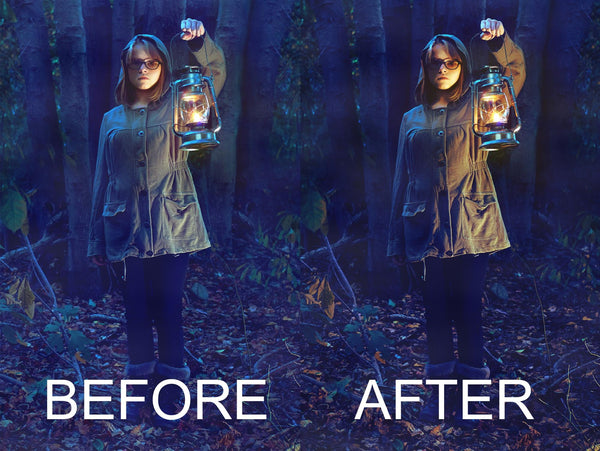
Figure 1.
What Software To Use
There are tons of photo editing software that you can use to color grade an image. In Justin Lister’s color grading course, he explains how he uses Lightroom as a color grading software. The concepts and ideas to achieve cinematic color grading, however, can translate to almost any current photo editing software. I happen to use Capture One as my primary raw processor and do my final color grading in Photoshop.
Cinematic Color Grading Is Timeless
The brief presented by the Pro Edu team contained a classic cinematic color grading theme, using rich blues, yellows, and oranges. The color grading was required to use specific HEX code colors. While this may seem daunting, the process outlined before can be used to color grade almost any image, to achieve a classic cinematic feel using specific colors.


Figure 2.
Color Magic Doesn’t Happen All At Once
Photoshop has several tools that can be used to color grade. For this image, I used Color Balance after the composite work and a Gradient Map for the final color grade.
In the Color Balance Properties tab, you can adjust the hues in the Shadows, Midtones, and Highlights. Adjustments made with the Color Balance tool are generally subjective in nature because you’re not using specific HEX code colors. However, the tool is a great place to start getting that cinematic color grading. I added some blue, green, and red to the Shadows; yellow, green, and red to the Midtones; and added blue and cyan to the Highlights.

Figure 3.
 Figure 4.

 Figure 5.
Blue And Gold - A Great Color Grading Recipe
The Color Balance tool gave this image a nice rich blue color in the shadows and midtones, while still having that crisp gold hue in the highlights. If an image is being created based on feel and not specific HEX code colors, the Color Balance tool is a primary method for color grading. However, in this instance, we are using specific HEX code colors. Luckily, Photoshop has a tool that can use use specific HEX code colors: Gradient Map.

 Figure 6.
Color Grading With Five Colors. What?
The Color Balance tool affected the Shadows, Midtones, and Highlights. The Pro Edu brief listed five colors. With a Gradient Map many colors can be used, and are applied to the image from the darkest areas of the image to the brightest areas. Gradient Maps are a wonderful tool for color grading because you can use specific Hex code colors in the tool.
When you first activate a Gradient Map layer, this is what the Properties Tab looks like.


Figure 8.
The gradient shown is based on the Foreground and Background colors you have selected. Here we have Black and White.
Click the gradient itself and the familiar Gradient Editor window opens.

Figure 9.
The number of points and their position in the gradient will affect your color grading.
I think of this image as five areas of light, instead of three areas of light. This gives me the flexibility to have more points, but also to make sure I’m assigning the right colors to the right areas. I do not want a super dark color where there is supposed to be a Highlight, nor do I want bright colors in the Shadows.
The five areas of light: Shadows, Shadow Midtones, Midtones, Highlight Midtones, Highlights.
Let’s assign some colors:
- Shadows: 011640
- Shadow Midtones: 021F59
- Midtones: F2622E
- Highlight Midtones: F2AE30
- Highlights: F2D43D
This is how all the colors look next to each other. Notice how we get progressively brighter as we look from left to right.

Color Grading Can Sometimes Be An Experiment
It can take some experimentation to find the best position for each color in your Gradient Map. I spent quite a while moving the points ever so slightly to see how they affected the image. Originally the Layer Blending mode was set to Normal, so that I could see exactly what areas of the image the colors were affecting.
The image below shows how the Color Blending Mode affects the image.


Figure 11.
Soft Light Makes Color Integration Seamless
Finding the right Layer Blending mode can take awhile. Often I’ll scroll through all the options just to “see what happens.” Art is mostly subjective, so there is no wrong or right in which Layer Blending option is chosen, but some options create a more aesthetically pleasing image than others. For me, the soft light Layer Blending option makes the color integration seamless.
The Final Image


Figure 12.
Wrapping It all Up
Color grading can seem like a very daunting task, especially if you aren’t super familiar with it. It will take practice and experimentation to find out what process will work, and what will definitely not work. Mistakes will happen, but don’t give up! Over time, you will be able to achieve some sweet cinematic color grading with ease.
Guest Blogger Dave Schick is a photographer and digital artist based in Groton Connecticut


