We all want our art to look better. Good composition can make a big difference. It can take our work from okay to amazing.
There are some key rules that can help. These rules guide how we arrange things in our art.
Learning these rules can help us create more eye-catching and balanced artwork.
We'll look at 12 important composition rules in this article.
1) Rule of Thirds
The Rule of Thirds is a fundamental principle in visual composition. It's a simple yet powerful tool that can dramatically improve the impact of our photos, paintings, and designs.
To apply this rule, we imagine dividing our image into a 3x3 grid. This creates nine equal parts with two horizontal lines and two vertical lines.
The key is to place important elements along these lines or at their intersections. This creates more interest and energy in our composition compared to centering the subject.
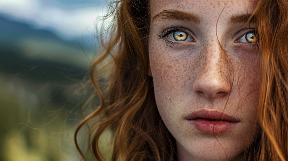
We can use this rule for various elements in our artwork. It could be the horizon line in a landscape, a person's eyes in a portrait, or the main subject in a still life.
The Rule of Thirds helps us create balance and visual flow. It guides the viewer's eye through the image in a natural way.
While it's a useful guideline, we shouldn't feel constrained by it. Sometimes breaking the rule can lead to striking compositions. The key is understanding when to use it and when to deviate for creative effect.
By practicing this rule, we can train our eye to spot strong compositions. It's a great starting point for beginners and a valuable tool for experienced artists alike.
2) Leading Lines
Leading lines are powerful tools in visual composition. They guide the viewer's eye through an image toward key focal points.
We can use roads, rivers, fences, or other linear elements to create these paths.
Leading lines in photography often start at the bottom of the frame. They draw attention upward or inward, connecting the foreground to the background. This technique adds depth and dimension to our images.
We can find leading lines in many places. A winding road through mountains or a bridge stretching to a cityscape make great examples. Even staircases or railway tracks can serve as effective leading lines.
The lines don't have to be straight. Curved paths like rivers or s-shaped roads work just as well. They create a more gentle, flowing movement through the composition.
When using leading lines, we should consider where they direct the viewer's gaze. It's best to have them point towards the main subject or an interesting part of the scene.
We can also use multiple leading lines to create more complex compositions. This adds visual interest and can guide the eye to several important elements in our image.
Mastering the use of leading lines takes practice. We should experiment with different angles and perspectives to find the most effective lines in each scene.
3) Golden Ratio
The Golden Ratio is a mathematical proportion that creates visually pleasing compositions. It's roughly equal to 1.618 and is often represented by the Greek letter phi.
We can use the Golden Ratio in art by placing key elements along lines that divide the canvas according to this proportion. This creates a balanced and harmonious layout that's naturally appealing to the eye.
One way to apply the Golden Ratio is through the phi grid. It's similar to the rule of thirds, but the lines are closer to the center. This results in a grid with nine unequal boxes.
We can also use the Golden Ratio to create a spiral. This spiral shape often appears in nature and can guide the viewer's eye through our composition in a flowing, natural way.
Many famous artworks incorporate the Golden Ratio. For example, the Mona Lisa's canvas is a Golden Rectangle, with its width to height ratio very close to 1.618.
To use the Golden Ratio in our own work, we can start by drawing a Golden Rectangle. We then use this as a guide for placing our main subjects and compositional elements.
By incorporating the Golden Ratio, we can create art that feels balanced and aesthetically pleasing. It's a powerful tool for improving our visual compositions.
4) Framing Techniques
Framing is a powerful tool in visual composition. We use framing to draw attention to the main subject of our image. It helps create depth and context within the scene.
Natural elements make great frames. Trees, doorways, and arches can surround our subject. These frames guide the viewer's eye to the focal point.
We can also create frames with man-made objects. Windows, mirrors, and fences work well. Even shadows or patterns can act as frames in our compositions.
Framing doesn't always mean surrounding the entire subject. Partial frames can be just as effective. They add interest without overpowering the main focus.
Framing techniques can improve the storytelling in our images. They provide information about the setting and atmosphere. This extra context enriches the viewer's experience.
When using frames, we consider their shape and size. The frame should complement the subject, not distract from it. We aim for balance between the frame and the main element.
Framing can also create a sense of mystery or intrigue. By hiding part of the scene, we spark curiosity in the viewer. This encourages them to look deeper into the image.
5) Balance and Symmetry
Balance and symmetry are key elements in creating visually appealing artworks. They help distribute visual weight evenly across a composition, making it feel stable and harmonious.
Symmetrical balance occurs when elements are evenly distributed on both sides of a central axis. This creates a mirror-like effect and can convey a sense of order and formality.
Asymmetrical balance is more dynamic. It uses different elements on each side of the composition to create equilibrium. This approach can add interest and tension to an artwork.
We can achieve balance through various means. Color, shape, size, and texture all play a role in how we perceive visual weight. By carefully arranging these elements, we can create a sense of stability even in complex compositions.
Balance in art isn't limited to visual elements. It also applies to negative space, which is just as important as the objects in our artwork. The right balance of filled and empty areas can greatly enhance the overall impact of a piece.
When working with balance and symmetry, we should consider the emotional impact we want to create. Symmetrical compositions often feel calm and orderly, while asymmetrical ones can evoke excitement or movement.
6) Negative Space Usage
Negative space is a key element in art composition. It's the area around and between the main subjects in a piece. We often overlook it, but it's just as important as the subjects themselves.
Negative space creates visual balance in a composition. It gives the eye a place to rest and helps define the main subject. When used well, it can make a piece more striking and memorable.
To use negative space effectively, we need to pay attention to the shapes it creates. These shapes can be just as interesting as the main subject. They can even form hidden images or symbols.
We can use negative space to guide the viewer's eye through our work. By carefully arranging it, we create a path for the eye to follow. This helps tell a visual story or emphasize certain elements.
Negative space doesn't have to be empty or white. It can have color, texture, or subtle patterns. The key is to keep it less detailed than the main subject.
Practice seeing negative space by doing reverse drawings. Draw the spaces around an object instead of the object itself. This helps train our eyes to see the whole composition, not just the main subject.
7) Color Theory Application
Color theory is a key part of visual art. When we use it right, our art can really pop. Let's look at how we can use color to make our work better.
The color wheel is a good place to start. It shows how colors relate to each other. We can use this to pick colors that work well together.
Complementary colors sit across from each other on the wheel. When we put these next to each other, they stand out. This can make parts of our art catch the eye.
We can also use color to set a mood. Warm colors like red and orange can make a piece feel lively. Cool colors like blue and green can make it calm.
The 60-30-10 rule is helpful for balance. We use our main color for 60% of the space. A second color takes up 30%. The last 10% is for a pop of accent color.
We can change how a color looks by mixing it with gray. This can add depth to our work. It's a good way to make our art more interesting.
Color can guide the viewer's eye. We can use bright colors to draw attention to important parts. Duller colors can make other areas less noticeable.
8) Contrast for Emphasis
Contrast is a powerful tool in visual art. It helps draw the viewer's eye to important elements in a piece. We can use contrast in many ways to create emphasis.
One way is through value contrast. This means using light and dark areas to make certain parts stand out. Chiaroscuro is a technique that uses strong light-dark contrasts for dramatic effect.
Color contrast is another effective method. We can place complementary colors next to each other to create visual interest. For example, orange and blue or red and green make striking pairs.
Size contrast also works well. A small object next to a large one naturally draws attention. This difference in scale can make the smaller element more noticeable.
Texture contrast adds depth to artwork. Smooth areas next to rough ones create visual variety and focus. We can achieve this through different brushstrokes or materials.
Shape contrast is useful too. Placing organic, curved shapes near geometric ones creates an interesting visual dynamic. This difference in form catches the eye.
9) Pattern Recognition
Pattern recognition is a key element in creating visually appealing artwork. We can use repeating shapes, colors, or motifs to add rhythm and unity to our compositions.
Patterns can guide the viewer's eye through the piece and create a sense of harmony. They can be obvious or subtle, depending on our artistic goals.
In nature, we often see patterns like spirals, symmetry, and fractals. These can inspire our art and help create a connection with viewers.
We can use patterns to hold our design together, much like familiar phrases in music. This repetition can make our artwork more cohesive and pleasing to the eye.
When incorporating patterns, we should consider their size, spacing, and variation. Too much uniformity can be boring, while slight variations can add interest.
We can also use patterns to create contrast or emphasize certain areas of our composition. This technique can draw attention to our focal points.
By mastering pattern recognition, we can elevate our art and create more engaging visual experiences for our audience.
10) Diagonal Rule
The diagonal rule is a powerful technique in visual composition. It uses diagonal lines to create a sense of movement and energy in an image. These lines can be actual or implied, guiding the viewer's eye through the composition.
Diagonal lines add a dynamic feel to artworks and photographs. They break up the static nature of horizontal and vertical lines, creating visual interest. We often see diagonal compositions in landscape photography and paintings.
To apply the diagonal rule, we can position key elements along an imaginary diagonal line. This line usually runs from one corner of the frame to the opposite corner. We can also use multiple diagonal lines to create more complex compositions.
Diagonal compositions work well with the rule of thirds. By placing important subjects at the intersection points of diagonal and third lines, we create a balanced yet dynamic image.
Natural diagonal lines exist in many subjects. Think of stairs, roads, or tree branches. We can use these existing diagonals or create our own by angling the camera or arranging objects.
The diagonal rule helps lead the viewer's eye through the image. It creates a path for visual exploration, making our compositions more engaging and memorable.
11) Focal Point Creation
A focal point is key to grabbing viewers' attention in any visual art. It's the main subject that draws the eye and gives meaning to the composition.
To create a strong focal point, we need to make it stand out from the rest of the image. We can do this by using contrast in color, size, or shape.
Placing the focal point strategically is crucial. The rule of thirds can guide us here. Putting our main subject at one of the intersections often works well.
Leading lines are another powerful tool. We can use roads, rivers, or even shadows to guide the viewer's gaze to our focal point.
Sometimes, framing the main subject can make it pop. Natural elements like trees or architectural features can create a frame within our image.
Simplicity can be powerful too. By keeping the background clean and uncluttered, we make our focal point shine.
Lighting plays a big role in creating a striking focal point. A spotlight effect or dramatic shadows can really make our subject stand out.
12) Aspect Ratio Considerations
Aspect ratio plays a key role in how we frame and present our photos. It's the relationship between an image's width and height.
Common aspect ratios include 3:2, 4:3, and 16:9. Each ratio creates a different visual effect and can change how viewers perceive our images.
The 3:2 ratio is often used in traditional 35mm film cameras. It offers a balanced look that works well for many subjects.
A 4:3 ratio gives us a slightly more square image. This can be good for portraits or when we want to emphasize vertical elements.
For a wider, more cinematic look, we might choose 16:9. This ratio is great for panoramic shots and landscapes.
Square 1:1 ratios are popular on social media. They create a compact, focused composition that draws the eye to the center.
We can use aspect ratios to guide viewers' attention. A wider ratio can emphasize horizontal movement, while a taller ratio highlights vertical elements.
Sometimes, we might crop our images to change the aspect ratio after shooting. This can help us improve composition or focus on specific parts of the scene.
When choosing an aspect ratio, we should think about where our photos will be displayed. Different platforms and print sizes may work better with certain ratios.
Understanding Composition
Composition is the backbone of visual art. It guides the viewer's eye and shapes the overall impact of a piece. We'll explore how balance and perspective work together to create compelling compositions.
The Role of Balance in Art
Balance in art refers to the distribution of visual weight. It creates harmony and stability in a composition. Artists use different types of balance:
- Symmetrical: Elements are mirrored on both sides
- Asymmetrical: Uneven distribution that still feels balanced
- Radial: Elements radiate from a central point
Color, shape, and size all contribute to visual weight. Larger objects typically feel heavier than smaller ones. Dark colors often appear weightier than light ones.
We can use balance to direct attention. Placing a single object off-center can create tension and interest. This draws the viewer's eye to that area of the artwork.
The Impact of Perspective
Perspective gives depth and dimension to 2D artworks. It helps create the illusion of space on a flat surface. There are several types of perspective:
- Linear: Uses converging lines to show distance
- Atmospheric: Objects in the distance appear lighter and less detailed
- Isometric: Shows 3D objects without converging lines
Proper use of perspective can make a composition more engaging. It can lead the viewer's eye through the artwork. We can use it to emphasize certain elements by placing them in the foreground.
Perspective also affects the emotional impact of a piece. A high viewpoint can make the viewer feel powerful. A low angle can create a sense of vulnerability or awe.
The Importance of Focal Points
Focal points grab attention and guide viewers through an artwork. They create visual interest and help convey the main message or theme.
Directing the Viewer's Eye
Focal points act as anchors in a composition, drawing the eye to key areas. We can use various techniques to create strong focal points in our art.
Contrast is a powerful tool. A bright spot in a dark scene or a sharp object against a blurry background will naturally stand out.
Size and placement also matter. Larger elements tend to catch the eye first. The rule of thirds can help us position focal points effectively.
We can use lines and shapes to lead the viewer's gaze. Curved lines, pointed shapes, or repeated patterns can all direct attention to a specific area.
Color is another key factor. A pop of bright color in a muted palette or a warm tone among cool hues will draw focus.
By carefully planning our focal points, we can create more engaging and impactful compositions that effectively communicate our artistic vision.
Frequently Asked Questions
Composition rules play a key role in creating visually appealing art and photos. We'll explore common questions about these principles and how to apply them effectively.
What constitutes the rule of thirds in visual composition?
The rule of thirds splits an image into a 3x3 grid. Key elements are placed along these lines or at their intersections. This creates balance and visual interest in a piece.
Using the rule of thirds helps make artwork more dynamic. It guides the viewer's eye through the composition.
How do the principles of composition enhance the quality of visual artworks?
Composition principles give structure to artworks. They create harmony and guide the viewer's focus. Good composition makes art more engaging and memorable.
These rules help artists organize elements effectively. They create a sense of balance, movement, and visual flow in a piece.
Can you list ten basic rules of composition in photography?
- Rule of thirds
- Leading lines
- Symmetry and balance
- Framing
- Depth of field
- Simplicity
- Golden ratio
- Negative space
- Patterns and repetition
- Perspective
These rules help create well-composed photos that catch the eye.
What are the guidelines for integrating composition in brand photography?
Brand photos should reflect the company's identity. Use consistent colors, styles, and themes. Create a focal point that highlights the product or message.
Balance negative space with key elements. Use the rule of thirds to place important items. Ensure the composition guides the viewer's eye to the main subject.
How do composition rules apply to graphic design?
In graphic design, composition organizes visual elements. It creates hierarchy and guides the viewer's attention. The rule of thirds helps place key info.
Leading lines direct focus to important areas. Balance and symmetry create visual harmony. We use white space to prevent clutter and highlight crucial elements.
What are some lesser-known composition techniques that can impact photographic artistry?
Juxtaposition contrasts different elements for visual interest.
Layering adds depth by placing objects at different distances from the camera.
The golden spiral creates a flowing composition based on the Fibonacci sequence.
Breaking the rules can also create striking images when done thoughtfully.


