COMMON MISTAKES PHOTOGRAPHERS MAKE
"Success is no accident. It is hard work, perseverance, learning, studying, sacrifice and most of all, love of what you are doing or learning to do.” – Pelé
RETOUCHING MISTAKES IN PHOTOSHOP
Retouching, like any artistic pursuit, is subject to taste. Every photographer has their own visual style and will retouch photographs to suit their preferences. But there are a few portrait retouching mistakes to watch out for that will bring down the quality of your photo in almost every circumstance.
These are mistakes that can be made while using any software, from Capture One to Adobe Photoshop, so don't think your program will keep you safe. Avoiding these mistakes is all about training your eye.
Before explaining what these mistakes are, let’s define the broadest term for what constitutes a retouching mistake in the first place. A retouching mistake is anything that distracts from or contradicts the purpose or intention of the image. In this case, we’re also assuming the image is still meant to look like a photograph and not a digital painting or another artistic blend of styles.
A retouching mistake can also be considered a creative choice that falls outside the accepted bounds of the genre you’re working in. For example, removing identifiable marks such as freckles, moles, or scars, is common in commercial beauty work where the purpose is to sell a product. But removing those things is generally frowned upon in portraiture where the purpose is to create a record of an individual.
Finally, a retouching mistake could be anything that is physically unnatural when the portrait falls outside the boundaries of fantasy or caricature.
Now that we have a basic framework for how to think about retouching mistakes, let's look at the most common portrait retouching mistakes and how you can avoid them.
THE MOST COMMON RETOUCHING MISTAKES
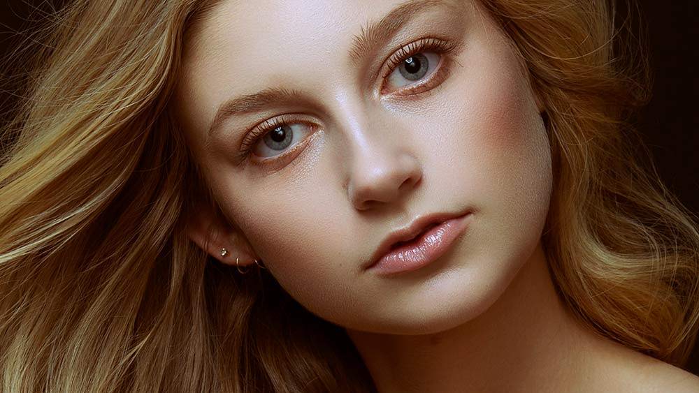
OVERLY BRIGHT EYES
Brightening the iris and whitening the sclera (the whites of the eyes) can draw attention to the portrait and increase the power of the connection between the subject and the viewers. But when this technique gets taken too far, the result is unrealistic and distracting.

The goal for eye retouching is to remove distractions and increase connection, interest, or beauty, not to make the subject look like they’re manifesting magic powers. Also, remember that the light on the subject determines how bright the eyes are. If you add too much light to the eyes in post-production, the result will be unnatural and distracting.
Model Abby Howard with Makeup by Nina Marie Diaz
NO LOWER EYE LIDS
Removing under-eye bags--or at least minimizing them--is relatively common practice in all genres of photography, but some understanding of anatomy is required to do this properly.
Eye bags exist below the lower eyelid and above the cheek in the area of the tear trough. This area can fill up with fluid depending on a person’s health, age, stress level, and whether they’ve had a good night of sleep.
Removing or minimizing under-eye bags can be a great way to improve an image, but removing the lower eyelid results in an unnatural-looking portrait that often falls in what’s called the “uncanny valley.” A casual viewer can tell something is wrong, but might not be able to put their finger on why.

Model Amelia Brull with makeup by Kimberly Davis
TOO MUCH SCULPTING
In the same way, too much contouring with makeup can be distracting, too much sculpting with dodge and burn can look unnatural. It alters the fall of light on the subject’s face, and when pushed too far, it can even change the appearance of the subject’s bone structure.
The right amount of sculpting with dodge and burn can increase the depth of the photo and create a 3D look that’s flattering. But too much can make the subject look like a coloring book, or not even look like themselves.

Model Amanda Kuschke with makeup by Kimberly Davis
LOSS OF TEXTURE
Texture cleanup and skin smoothing are areas in portrait retouching that are highly contested, particularly because doing this well requires a good eye and subtle touch. The changes in skin tone and skin texture are connected, and it's easy to get carried away with the power of Photoshop and damage one or the other.
In addition, many of the tools that speed up the process of retouching skin, such as frequency separation, can fall prey to overuse quite easily.
When any technique for skin smoothing is used too heavily it can make the skin look like plastic, or can make it look as if the skin color and texture are separate, with one floating on top of the other.

TOO-WHITE TEETH
Teeth whitening is another aspect of portrait retouching that is very easy to get wrong. Almost everyone looks better with pleasantly white teeth, but this can easily get carried too far.
It’s important to remember that, just like the whites of the eyes, teeth are subject to light direction and power. And, like skin, they have natural texture. Any time the teeth get whitened to the point of distraction, it looks unreal and pulls attention away from the subject and right to their mouth.

HOW TO AVOID RETOUCHING MISTAKES
I teamed up with PRO EDU to create a 3 tutorial series that covers getting into 3D via the Cinema 4D software and Octane Render Engine. We customized the curriculum to cater towards photographers and Photoshop users and built a learning environment with dialogue and assignments perfect for those coming from Photography. You have the option to invest in Intro to C4D (tutorial one) or buy the entire package and learn how to build commercial products with a mouse and a virtual photo studio that photographers can use and shoot in. Yes, you can shoot and create in the virtual studios.
GET FEEDBACK
Having a library of reference images you admire that represent the kind of work you want to create will help train your eye to see what proper retouching looks like.
Make sure to look at your references often and pay attention to how those issues are addressed. Then compare the references to your photo and see if you can spot the differences.
REFERENCE IMAGES
Before you ship or show your images, ask a friend you trust to give you feedback. Make sure it’s a person whose technique and eye you trust, and who you know has your best interest in mind. You’ve been looking at your photos for a long time and getting an unbiased opinion always helps catch things you might have missed.
WALK AWAY
Our brains are conditioned to see things in context, and when we see something for a long time we get accustomed to it. Before you share or ship your image, leave it alone for a while. Walk away, look at other things, give your eyes and your brain a rest so you can reset. You’ll notice all kinds of things you missed, and that will make it easier to spot mistakes.
CONCLUSION
These portrait retouching mistakes are common, but they don’t have to be. Retouching portraits well does require you to train your eye and learn what looks natural, what fits within the genre you’re working in, and what represents your vision of the final image.


