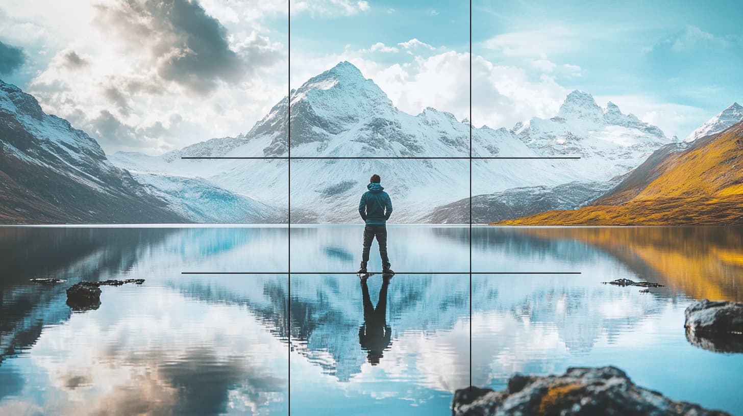
The rule of thirds is a powerful guideline in photography that helps create balanced and engaging images. By dividing a photo into nine equal parts using two horizontal and two vertical lines, we can place our subject along these lines or at their intersections, resulting in more dynamic and appealing compositions. This approach often leads to shots that are both aesthetically pleasing and well-composed.
Many of us have experienced taking photos that just don't seem right even though the subject is interesting. The rule of thirds can be a game-changer, helping us frame our shots with improved balance and focus. For instance, placing the horizon along one of the horizontal lines rather than in the center can create a more appealing landscape photo.
Understanding when and how to apply the rule of thirds can elevate our photography skills. It’s important to know not only how to use this guideline but also when it might be more creative to break it. This flexibility allows us to achieve unique results that stand out in different photography genres.
Key Takeaways
- The rule of thirds enhances photo balance and composition.
- This guideline places key elements along lines or intersections.
- Knowing when to use or break the rule boosts creativity.
Understanding the Rule of Thirds
The rule of thirds is a key principle in photography that helps us create balanced and visually appealing images. By understanding these concepts, we can improve our photographic compositions significantly.
Defining the Rule of Thirds
The rule of thirds is a compositional guideline that suggests dividing an image into nine equal parts. We do this by placing two equally spaced horizontal and two vertical lines to create a grid. The main idea is to place important elements of our photos along these gridlines or at their intersections.
This positioning helps draw the viewer’s eye to essential parts of the frame. It creates a sense of balance and makes the photograph more engaging. For instance, placing the horizon line along one of the horizontal lines can make a landscape photo more appealing.
Origin and Importance
The rule of thirds has its roots in classical art and has been used by painters for centuries. Photographers adopted this guideline to improve their compositions. It remains a fundamental principle in modern photography.
Its importance lies in its ability to guide us in framing shots that are both aesthetically pleasing and dynamic. By avoiding placing the subject at the center, we can create more interesting and balanced images. This technique works well for various types of photography, including portraits, landscapes, and architecture.
Rule of Thirds Grid
Using the thirds grid can help us apply this rule more easily. Most digital cameras and smartphones have a grid option that can be enabled in the viewfinder or screen. This feature helps us visualize the gridlines directly while framing our shots.
Placing key elements like a subject's eyes or a horizon line near these intersections can lead to a more compelling photo. The grid makes it straightforward for us to align our subjects and ensure we’re following the rule of thirds effectively.
In summary, enabling the rule of thirds grid on our devices can greatly aid in composing our shots according to this timeless compositional principle.
Application of the Rule in Different Genres
The rule of thirds can be a helpful tool in various genres of photography. By placing key elements along the lines or at the intersections of the grid, we can create a well-balanced and engaging composition.
Landscape Photography
In landscape photography, the rule of thirds is especially useful for creating balanced and dynamic images. By aligning the horizon with either the top or bottom third line, we can emphasize the sky or the land.
For example, if the sky is filled with interesting clouds or colors, we might place the horizon on the bottom third to give it more attention. On the other hand, if the landscape itself is more captivating, we place the horizon on the top third to draw the viewer's eyes downward.
Additionally, placing focal points such as trees, mountains, or buildings at the intersections of the grid can help lead the viewer's eye through the scene and add depth to the image.
Portrait Photography
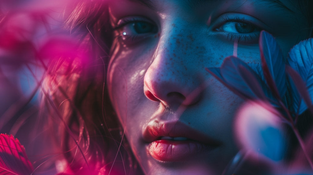
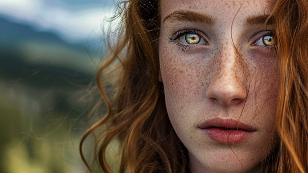
In portrait photography, the rule of thirds can guide where to place the subject within the frame for a natural and pleasing composition. Aligning the subject's eyes along the top third line can help create a strong focal point that draws in viewers.
By positioning the subject off-center, we avoid the static feel that can come from centering them. This also leaves space for the viewer's eyes to wander, making the portrait more engaging.
We can also use the intersections of the grid to emphasize parts of the subject such as the eyes or mouth, enhancing the emotional impact of the portrait.
Wildlife Photography
For wildlife photographers, the rule of thirds can help capture animals in a way that feels both dynamic and balanced. By placing the eyes of the animal on one of the grid intersections, we draw immediate attention to this key feature, making the photo more captivating.
If the animal is moving, we can position it on one side of the frame, leaving space in the direction it is heading. This technique not only follows the rule of thirds but also adds a sense of motion and anticipation.
Additionally, placing the horizon along a third line when capturing animals in their natural habitat can ensure that the composition feels balanced and natural, highlighting both the animal and its environment.
By applying these principles across different genres, we can enhance our compositions and create more visually appealing photographs.
Technical Aspects of Composition
In photography, the rule of thirds guides us to create balanced and engaging images. This involves using grids, intersecting points, balance within the frame, negative space, and leading lines.
Utilizing Grids and Intersecting Points
The rule of thirds suggests splitting an image into a 3x3 grid, creating nine equal parts. Placing key elements along these grid lines or at their intersections, known as “power points,” enhances composition. For example, an interesting subject placed at an intersection naturally draws the viewer’s eye. We often see better harmony and balanced composition by avoiding central placement. This also adds dynamism to the photograph, making it more visually appealing.
Balancing Elements in the Frame
Balancing elements is crucial for creating pleasing compositions. When we place a main subject along one of the rule of thirds lines, we must consider what fills the remaining space. Counterbalancing the primary subject with secondary objects or features prevents the image from feeling lopsided. This technique helps in achieving symmetry and harmony, ensuring that no part of the photo feels too heavy or too light. Proper balance guides the viewer's eye throughout the image smoothly.
Incorporating Negative Space and Leading Lines
Negative space, the area around the main subject, plays a significant role in composition. It gives the subject room to breathe and ensures the frame is not cluttered. Using negative space and leading lines directs viewers' eyes toward the focal point. Leading lines can be natural elements like roads, rivers, or architectural features. They guide the gaze through the photo, creating depth and drawing attention to crucial elements.
By incorporating negative space and leading lines with the rule of thirds, we create images that are not only well-composed but also engaging and dynamic.
Enhancing Visual Impact
In photography, using the Rule of Thirds can significantly enhance a photo's appearance. By placing subjects along the grid lines, we can create a more engaging and balanced image.
Creating a Pleasing Aesthetic
Positioning elements along the grid lines helps achieve a more pleasing aesthetic. This method aligns with how our eyes naturally view images, making compositions feel balanced and harmonious. For example, when photographing a landscape, we might place the horizon along the top or bottom third of the frame. This technique improves the overall composition by avoiding a static, centered look and instead imparting a more dynamic and inviting visual interest.
By using the Rule of Thirds, we can lead the viewer's eye to more interesting parts of the frame, enhancing the natural flow and rhythm of the image. This approach makes the photos not only aesthetically pleasing but also more memorable.
Employing Off-Center Composition for Dynamism
The Rule of Thirds encourages us to place key elements off-center, which adds dynamism to our compositions. This technique helps avoid the flatness of symmetrical subjects and enhances the visual impact by making the image more interesting to look at. By positioning subjects at the intersections, or "power points," we draw attention to these areas that naturally attract the viewer's gaze.
For example, if we’re capturing a person, placing their eyes along one of the grid lines instead of dead center makes the portrait more engaging. This method also adds depth and allows viewers to explore other areas of the frame, creating a more complete viewing experience. Utilizing off-center composition effectively transforms a static image into a powerful composition full of energy and interest.
Post-Processing and Fine-Tuning
In post-processing, we can use various tools to enhance our photos and emphasize the rule of thirds. Fine-tuning involves actions like cropping for better composition and knowing when to creatively break the rule.
Cropping for Improved Composition
Cropping is a crucial step in editing. By using the crop tool in applications like Lightroom, we can reposition the main subject to align with the intersecting points of the rule of thirds grid. This helps improve the composition and visual balance of the image.
To do this effectively, we should keep the following in mind:
- Ensure the main subject is not centered unless intentional.
- Reposition distracting elements to the edges or remove them entirely.
- Maintain aspect ratio to avoid distorting the photo.
Using Editing Tools to Emphasize the Rule
Editing tools can further enhance our compositions. Programs like Lightroom offer overlays to display the rule of thirds grid automatically during cropping. We can also use tools to adjust brightness, contrast, and color to draw attention to key areas.
Here are key tips:
- Use the "O" shortcut in Lightroom to activate the rule of thirds overlay.
- Balance light and shadow to guide the viewer's eye.
- Enhance color contrast around the main subject to make it stand out.
These practices help reinforce the composition and make our photos more compelling.
Breaking the Rule for Creative Expression
While the rule of thirds is a useful guideline, there are times when breaking it can lead to more creative and striking images. Center focus can be powerful, especially in symmetrical shots or portraits where the subject's face is the key element.
Consider the following when breaking the rule:
- Symmetry: Use center focus for symmetrical scenes for a balanced look.
- Emotion: Portraits can benefit from centering the subject to emphasize emotions.
- Unique compositions: Experiment with unconventional framing to create unique effects.
Breaking the rule should be a deliberate choice to serve the photo's story or aesthetic. By understanding and sometimes disregarding the rule of thirds, we can achieve greater creative freedom in our photography.
Frequently Asked Questions
The rule of thirds is a fundamental concept in photography that helps structure image composition. It enhances the visual appeal and balance of photographs, making it an essential technique for photographers at any skill level.
How does the rule of thirds improve composition in photography?
The rule of thirds divides an image into nine equal parts with two equally spaced horizontal and vertical lines. By placing key elements along these lines or their intersections, we create balance and interest in the photo. This technique can lead to more captivating and dynamic images.
What are the basic principles of the rule of thirds for beginners?
Beginners should start by imagining their viewfinder split into nine equal parts. Aligning the main subject along these lines or their intersections helps to avoid a centered composition, which can appear static. This simple guideline helps in creating more engaging photos.
Why is the rule of thirds considered important in photographic composition?
This rule is important because it provides a simple yet effective way to enhance photo composition. By distributing visual weight across the grid, our photos often become more visually appealing and balanced. This technique guides the viewer’s eye more naturally around the image.
How can the rule of thirds grid be utilized in portrait photography?
In portrait photography, positioning the subject's eyes along the top horizontal line can make a more compelling composition. Placing the subject on one of the vertical lines can add interest and create a balanced background. This approach often leads to portraits with a stronger impact.
In what ways do leading lines complement the rule of thirds in photography?
Leading lines, which direct the viewer’s eye along a path, work well with the rule of thirds by naturally guiding attention to the intersections or lines where key elements are placed. This combination enhances the flow and harmony of the composition, making photos more engaging.
Can you provide examples of effective use of the rule of thirds in photographing landscapes?
When photographing landscapes, placing the horizon along the top or bottom third can create a balanced image. For example, placing a tree or a mountain at one of the vertical thirds instead of the center can make the scene more dynamic. These techniques help in capturing more visually appealing landscapes.


