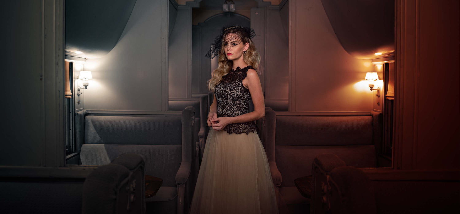
So What Is Color Grading?
Color grading is just for movies right? Isn't that how the director visually cues us that we're suddenly in a flashback scene?
Yes it is! Simply understanding that single use of color as a narrative instrument will allow you to jump into the world of color grading with both feet.
Color grading is indeed a term pulled directly from cinema. It has connections to film stock choices and the goal to achieve a look. But grading is only recently as common in still photography, exploding with the advent of the smartphone and apps like instagram and Adobe's mobile apps.
From Motion to Stills
Originally, photographers were just taking steps to balance their photographs to get an accurate representation of the world and the image as they saw it. Then came the digital darkroom - suddenly we've got all these incredible tools to balance images in the computer, in post! Fantastic.
These color tools are so powerful that within the last 5 - 10 years with the raw converters becoming super robust, we're now at the stage where they are the most powerful environment for manipulating color, even surpassing Photoshop itself in substantial ways.
But how do these grading tools integrate into the workflow of a professional retoucher? That's been the question we've been answering the past few years.
The New Color Grading Workflow
Traditionally, our training tells us "Do all your color work in Photoshop!!! Camera Raw is only for balancing!!!"
Well, more and more that started to feel like a trade off that was tilting the wrong way. "Dammit I wish I had Adobe Camera Raw to use whenever I wanted..." I'd find myself thinking constantly.
And then boom - with the release of CC, Adobe silently dropped the Adobe Camera Raw Filter on us. And we were forever changed.
For me and many of my colleagues, just that act of adding it as a filter suddenly provoked the question, "In what other ways can we use this powerful tool, on Raws or otherwise?" If you know anything about me and my buddy Earth-O, you know that we're constantly trying to figure out how to use overlooked or under-utilized tools in Photoshop to make our workflows better, to keep pushing things forward.
That step started us down the path of using Adobe Camera Raw in new and unexplored ways. We now do extensive work in the ACR environment using it as a Smart Filter in our work files - making grain layers, using the noise reduction, building band-less gradients, but most importantly using the super-intuitive color adjustment tools for grading.


Color Is Endless In Possibility - Where Do We Start?
I started experimenting with color like anybody else, from my gut. Early in my art studies, color theory seemed authoritarian, academic, and unintuitive (all things I disliked), so I just ignored it. And a lot of my work in college reflected that. Color interactions are complicated, and color theory is the roadmap to making informed decisions.
The one thing I wish somebody would have sat me down and told me right up front: You don't need to know a lot of color theory to make huge strides.
I'll say it again: the one big thing I see retouchers and photographers getting wrong about color is that they think they're locked into the colors that exist in the photograph. I've been guilty of the same thing, I'd been using a bunch of different methods, tools, and steps to just tweak with things. Like everybody else, I had just been running on auto. I'd never taken a step back to question, document, and refine the process. (Do that!) So after many years I finally stopped, sat down, and mapped out my entire color workflow. And I'm glad I did.
Now I have a grading workflow that tells me where to start every single time.
Start With A Color Audit
I love a good audit. (Not the kind that sucks). I love to drop an image into Adobe Color CC and figure out what's really going on in the image. Because the eyes deceive us. Our optics and brains do tons of work to reconcile all sorts of components of our visual field into a cohesive structure. Using software and couple of analytic steps can quickly show us exactly what colors we're dealing with in an image.
No Neutrals
Nothing is really ever gray. Unless it is. But that's rare.
I have a hard time seeing gray these days. After a long career in studio and digital art I can't help but see color in everything. "That's not gray, that's purple," you'll hear me say when presented with an apparently neutral garment for reference. But you don't need years of rewiring your brain to figure this stuff out, you can use Adobe software to help identify colors.
Fun exercise alert - I always ask my students and assistants to try to identify true colors with their eyes when they're out and about. Green is never actually green in nature. It's mostly yellow and blue. Clouds are not white. If you're in a white room with a single natural light source, just look at all the color. Nothing is neutral. There's varying hues of yellow-orange to blue-lavender everywhere. Colors also become different by virtue of their neighbors. Starting to pay attention to these things will make you a better artist.
Even though I'm highly color-aware I still rely on these Color Audit tools to figure out what's going on. Bottom line: If we know what's going on in the image regarding the color, then we have very clear prescriptions for how to proceed. If not, we're just guessing - fumbling around in the dark - which isn't always bad, but I suggest learning the rules before breaking them.
Tune your color
Most of the time, especially shooting in nature, color harmonies will already exist in your images, they're just waiting for you to turn up the volume and adjust the bass, treble, and midrange. The dominant hue needs to be mellowed out a bit to not be too saturated, any smaller complements should be turned up to be pop colors. Clearly I'm referring to complementary schemes here, which are often the most important to us in relation to non-illustrational color grading. A full range of color always conveys depth and form more effectively to the eye.
Color Choices
I'm not going into a tutorial on color theory here. But there's a book I always refer people to - it's called Color Choices. And you can find a link to it through my kit page.

Using a fantastic book like that - which is made for painters, but don't mind that - to get an applied understanding of color theory is a really easy way to make huge strides in understanding and control. The vast majority of other books you'll find are very much in the theory side of color theory. Very valuable, but not something you can put to work immediately (and just might put you to sleep).
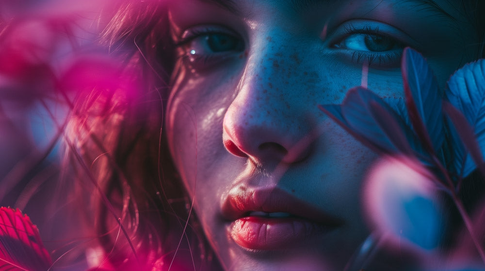
Split Tones
One basic thing to understand is that pretty much every creative grade beyond a color harmony tune-up is employing some kind of split tone. A split tone is just assigning different colors to the darks and lights in an image. It works really well to use compliments, but other harmonies work well too.
Remember when everything in modern Hollywood movies turned green and red-orange? Yeah, there are major split-tone trends that catch on and get really played out.
Contrast
The other big component of a 'look' is the quality of the dynamic range and exposure of the image. First thing to check is - are the blacks clipped or lifted. This is a really common treatment for getting that ethereal look, kind of dreamy. But often the whites can be filled in a little bit, adding to the compression of the range. This might seem counterintuitive - the hallmark of color correction since the dawn of time has been to increase the dynamic range. One of the downsides of polaroid photos compared to film was the lack of contrast. Over time though that became a look and was a desirable thing to achieve in a creative grade in order to tell a story about memory and nostalgia.
Color As Story
Far smarter people than me have investigated the meaning of color in culture (see: Kate Woodman's Science of Color Tutorial). It's a huge topic and I am no color anthropologist, but I do know a lot about how to leverage color choices to improve or create story. A properly exposed image with expected, natural colors tells its story mainly through the content within the photo. But a creatively graded photo takes us out of the space and activates the surface, really emphasizing the viewers position as the outsider. A creatively graded photo is a different world.
It's amazing to me how little understanding even experienced artists have of what's going on in a given color grade. Start practicing - look at really cool imagery you see out in the wild and try to unpack it with your brain and eyes. That'll help you once you switch to leaning on software to do the job.


See-And-Say
Up until I was using analytic tools like Adobe Color CC, I developed an analog workflow for unpacking grades. And I'd always rely on what I now call my Color Audit. And it's as simple as identifying all of the attributes that I've discussed so far, see it and say it (or write it down).
- What color are the blacks, the whites?
- Is there an overall color cast?
- Is there a dominant hue, how saturated is it?
- Are there any complements to the dominant, are they pure?
- What is the contrast - high or low?
- What's up with the dynamic range, is it clipped on either end? How much?
If you've answered those questions, you've essentially unpacked a grade. And knowing that information will allow you to recreate it with a pretty high level of accuracy on a different image.
Not All Grades Translate
There is an important point to understand if you're in the market for buying pre-packaged color grades or if you're trying to match an existing grade for a client who is just not convinced it looks the same as the example she gave you: A grade completely depends on the exposure, color, and composition of the photo it's applied to.
Night will never be day, ever. Overcast will never be bright and sunny, ever. Backlit will never be lit from the front, EVER. So this gets back to my point that I want you to practice the analog Color Audit and get better by using your eyes and brain. You may need to explain to a client the reasons why some grade-match may not be working to satisfaction, and the only way to do that is to understand what's going on under the hood and have a handle on the vocabulary - the voice of authority has a sound to it and you need to be able to develop that level of confidence. Additionally, if you're buying a fantastic looking commercial creative grade that looks beautiful on the example images from the website, but disappoints when you run it on your shots, you'll be able to understand why and know the steps to help it get better rather than ask for a refund.
Go With Confidence, Rembrandt
Congratulations on reading to the end of my little essay on color grading - it's likely that just showing up for this has pushed you closer to a level of understanding that beats your peers. I don't run into a lot of photographers or retouchers who have a strong vocabulary around color. Quite the opposite - a terrifyingly large number have very little training at all. And that's a shame because just a little color theory can really work wonders, which is why I wanted to share a systematic workflow that could be relied on every time. On the one hand color is complex and limitless. On the other it adheres to very consistent set of rules, which I hope is comforting.
Many of the greatest artists in the history of the world spent their lives trying to understand color through their paintings (which I actually like to think of not as paintings necessarily but color experiments). Look at Van Gogh, Monet, Bonard, Matisse. Take a look through Monet's haystacks, just Google it up. He basically set up a library of color grades that you could apply to your images, now that you know how to unpack them.
Rembrandt said to his last day that he was a student of color, that he had by no stretch of the imagination figured it out. So maybe that'll give you a little more confidence. If that guy didn't have it all figured out, nobody's going to expect you to.

Article Written By Sef McCullough


